
Building an SEO Dashboard in Looker Studio
How to build a working SEO dashboard in Looker Studio using Search Console and GA4, with the six charts that actually matter.

Published August 2026. A useful SEO dashboard in Looker Studio connects Google Search Console and GA4 directly, shows trend over time rather than a single snapshot, and answers three questions at a glance: is organic traffic growing, which pages and queries drive it, and is that traffic converting. Building one takes under an hour once you know which data sources and charts actually matter, most of the complexity in tutorials online is optional polish, not a requirement.
What Data Sources Do You Actually Need?
Two data sources cover the core of an SEO dashboard for most sites:
- Google Search Console. Looker Studio has a native GSC connector that pulls impressions, clicks, average position, and CTR by query, page, country, and device, no third-party connector required.
- GA4. Also natively connected, giving you sessions, engaged sessions, conversions, and revenue where e-commerce tracking is set up, segmented by channel so you can isolate organic search specifically.
Beyond these two, rank tracking tools (SEMrush, Ahrefs, or similar) can add keyword position history if you’re already paying for one, but they’re not required to build a functional dashboard. Start with GSC and GA4 only, you can always add a third source later once the core dashboard proves useful.
How Do You Set Up the Connections in Looker Studio?
- Create a new report at lookerstudio.google.com and choose “Blank Report.”
- Add the Search Console connector from the data source picker, authenticate with the Google account that has GSC access, and select the property.
- Add GA4 as a second data source in the same report, selecting the correct GA4 property.
- Set a default date range control at the top of the report, last 28 days is a sensible default that aligns with GSC’s typical reporting lag.
- Add a comparison period if you want month-over-month or year-over-year context on key charts, which Looker Studio supports natively through the date range comparison setting.
A common early mistake is blending GSC and GA4 data into a single table without understanding they measure different things, GSC counts clicks from search results, GA4 counts sessions after a user lands on the page. They won’t match exactly, and that’s expected, not a bug in your setup.
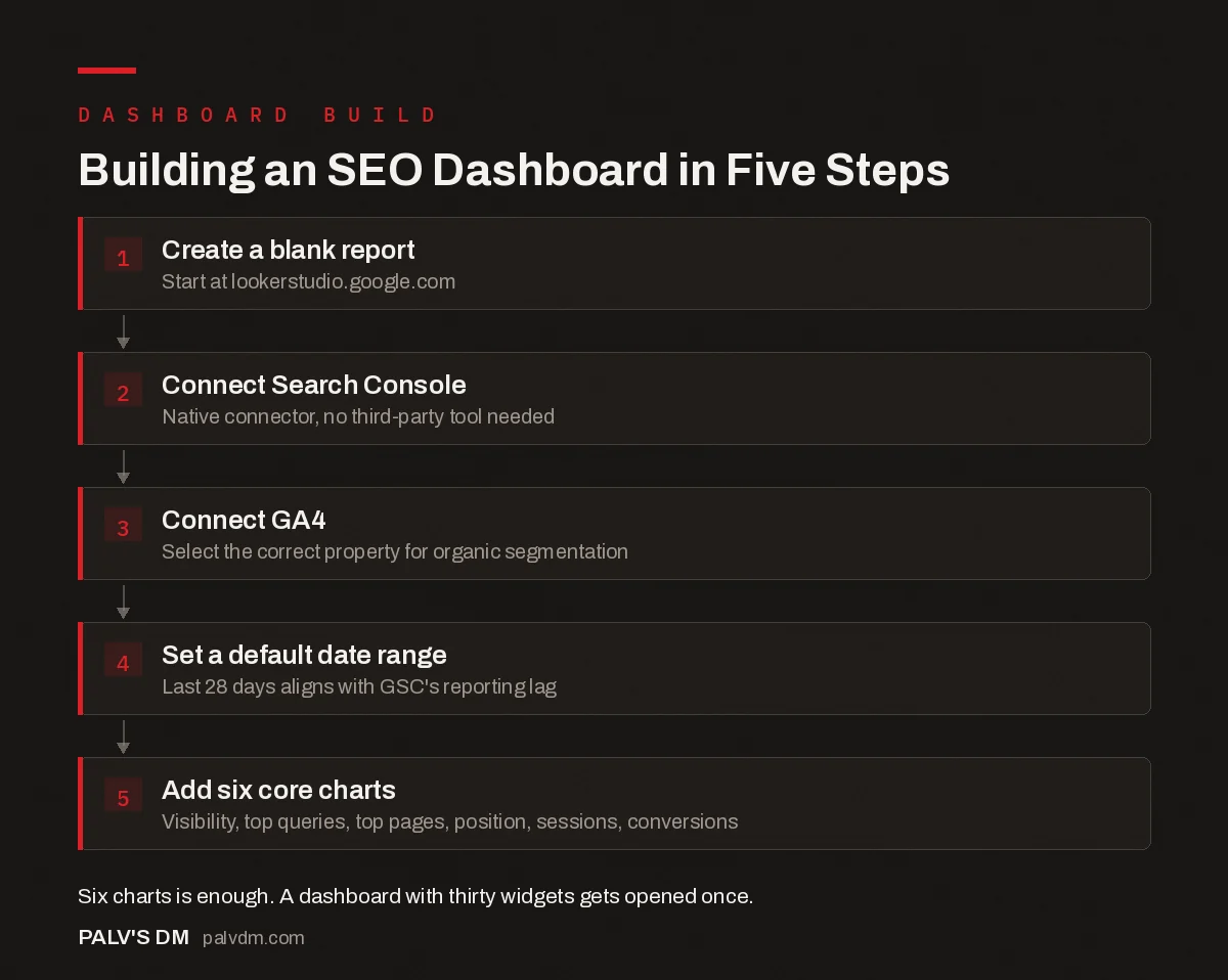
Building an SEO Dashboard in Five Steps
- Create a blank report. Start at lookerstudio.google.com.
- Connect Search Console. Native connector, no third-party tool needed.
- Connect GA4. Select the correct property for organic segmentation.
- Set a default date range. Last 28 days aligns with GSC’s reporting lag.
- Add six core charts. Visibility, top queries, top pages, position, sessions, conversions.
Which Charts Should Be on the Dashboard?
| Chart | Data Source | What It Answers |
|---|---|---|
| Clicks and impressions over time | GSC | Is organic visibility trending up or down |
| Top queries by clicks | GSC | What’s actually driving traffic |
| Top landing pages by clicks | GSC | Which content earns the most search traffic |
| Average position by query group | GSC | Where you stand on priority keywords |
| Organic sessions and conversions | GA4 | Whether traffic converts, not just arrives |
| Engagement rate by landing page | GA4 | Which pages hold attention after the click |
Six charts is enough for a working dashboard. Resist the urge to add every metric available just because the connector makes it easy, a dashboard with thirty widgets gets opened once and abandoned.
What’s the Difference Between a Client Dashboard and an Internal One?
A client-facing dashboard should show outcomes: traffic trend, conversions, top-performing content, position on priority keywords. An internal working dashboard for your own SEO team can go deeper, crawl error trends, indexing status changes, keyword cannibalization flags, page-by-page technical scores. Mixing the two into one report usually means either overwhelming the client or stripping out detail your own team needs day to day.
Building two versions from the same underlying data sources is straightforward in Looker Studio, duplicate the report, then trim or expand the chart set for each audience. The data connections stay identical; only the presentation layer changes.
How Do You Keep the Dashboard From Becoming Unreadable?
- Group by purpose, not by data source. Put “visibility” charts together and “conversion” charts together, rather than a GSC section followed by a GA4 section with no narrative connecting them.
- Use a scorecard row at the top. Four or five single-number scorecards (total clicks, total conversions, average position, engagement rate) give an at-a-glance summary before anyone scrolls into detail.
- Filter out branded queries where relevant. Branded search traffic (people searching your company name) inflates numbers without reflecting new-customer acquisition. A filter or separate tab for branded vs non-branded queries keeps the headline numbers honest.
- Label charts in plain language. “Organic Clicks vs Last Period” reads better to a client than a raw GSC field name like “Clicks (Google Search Console).”
How Do You Add Calculated Fields Without Overcomplicating the Report?
A few calculated fields add real value without needing SQL knowledge. CTR calculated as clicks divided by impressions is often already provided by the GSC connector, but a custom “conversion rate from organic” field (organic conversions divided by organic sessions) usually needs to be built manually by combining fields from GA4’s connector, since it isn’t a default metric.
Keep calculated fields to a handful that map directly to a business question. A dashboard with twenty custom formulas becomes fragile, if Google changes a field name or a metric definition, every formula referencing it can break at once, and tracking down which one failed takes real time.
Should You Build One Dashboard or Multiple Tabs?
For a single site, one dashboard with a few tabs (Overview, Queries & Pages, Conversions, Technical) organizes the detail without forcing everyone to scroll through everything. For an agency managing several client accounts, a shared template with per-client data source connections lets you replicate the structure without rebuilding from scratch each time, Looker Studio supports this through report copying, keeping the layout consistent while swapping the underlying data source per client.
How Often Should You Revisit the Dashboard Structure?
Review the chart set every quarter, not every month. A dashboard built around this month’s priorities can go stale fast if you keep bolting on new charts without removing ones that stopped being useful. A quick test: if nobody has referenced a specific chart in the last two reporting cycles, it’s a candidate for removal, not permanent real estate.
What Are the Most Common Setup Mistakes to Avoid?
A handful of mistakes show up repeatedly in dashboards built by teams doing this for the first time:
- Connecting the wrong GSC property. A domain property aggregates www, non-www, and both http and https versions of a site, while a URL-prefix property covers just one variant. Connecting the wrong one produces numbers that don’t match what someone sees checking GSC directly, causing confusion that has nothing to do with Looker Studio itself.
- Leaving the date range unlocked for viewers. If a client can freely change the date range and lands on an unusual window (a single holiday day, for instance), the numbers they see may look alarming purely because of a short, unrepresentative period. Setting a sensible default range, even if viewers can still change it, avoids most of these false alarms.
- Mixing sampled and unsampled data without noting it. Very high-traffic GA4 properties can occasionally return sampled data in certain report configurations, which introduces a margin of error not obvious from the chart alone. It’s worth checking whether this applies to your data volume before presenting numbers as exact.
- Building charts around whatever fields were easiest to add, rather than the specific questions a client or manager actually asks in meetings. Starting from the questions, not the available fields, produces a dashboard people actually use.
How Should You Handle Multi-Region Sites in One Dashboard?
Sites serving multiple regions through separate URL paths or subdomains need a decision made early: one blended dashboard with a region filter, or separate dashboards per market. A blended view with a filter works well when the audiences are similar enough that comparing them side by side is useful. Separate dashboards make more sense when markets are managed by different teams with different goals, since forcing them into one shared view usually buries someone’s priority metrics under someone else’s.
FAQ
Is Looker Studio free to use?
Yes, the core product is free, including the native GSC and GA4 connectors used in this setup. Paid connectors exist for pulling in data from platforms without a native Looker Studio integration, but they’re not required for the dashboard described here.
How current is the data in a Looker Studio SEO dashboard?
GSC data typically has a two-to-three day lag before it’s fully available, which is a property of Search Console itself, not a Looker Studio limitation. GA4 data is generally available same-day or within a few hours. Build this lag into how you interpret “yesterday’s” numbers, they may still be incomplete.
Can clients access the dashboard directly, or does it need to be a static report?
Both are possible. You can share view-only access to a live dashboard so clients can check numbers anytime, or schedule Looker Studio’s built-in email delivery to send a PDF snapshot on a set cadence. Many agencies do both, live access for clients who want it, scheduled delivery for those who prefer a summary in their inbox.
Do I need to know SQL or coding to build this?
No. The native GSC and GA4 connectors handle the data plumbing without any query writing. Basic familiarity with drag-and-drop chart building in Looker Studio’s interface is enough for the setup described here, more advanced calculated fields exist if you want them later, but they’re optional.
Why does my Looker Studio GSC data not match what I see in Search Console directly?
This is almost always a property mismatch (connected to the wrong domain or URL-prefix property), a date range difference, or a filter applied in one view but not the other. Before assuming a connector bug, confirm both are pointed at the same property, the same date range, and the same filters, if any.
Turning Raw Data Into a Dashboard Worth Checking
The gap between a dashboard nobody opens and one that becomes part of a weekly routine usually comes down to restraint, fewer charts, clearer labels, and a structure organized around the questions people actually ask, not around whatever fields the connector happens to expose. Build the six-chart version first and add complexity only when you’ve identified a real gap.
If you’d rather have this built and maintained rather than doing it yourself, dashboard setup and ongoing reporting infrastructure is part of our SEO Growth service for clients who want visibility without managing the tooling themselves.
For what to actually say in front of this dashboard each month, see the SEO report clients should get every month. To automate the delivery of this data on a schedule, read automating client reporting from Data Studio to Looker Studio. And for the metrics this dashboard should deliberately leave out, see vanity metrics in SEO reporting and what to replace them with.
For the Search Console reports that feed this dashboard directly, see Google Search Console: the reports that actually matter.