Pricing Page Design: Structure, Anchoring and Clarity That Convert
How to structure a pricing page that converts: tier count, anchoring without manipulation, and what goes above the fold.
A pricing page that converts needs three things: a clearly recommended option, prices visible without a form, and enough detail for visitors to self-qualify before they contact you. Most underperforming pricing pages fail at the first one. They list options with equal visual weight, so nothing anchors the decision, and the visitor is left doing the comparison work the page should have done for them.
This isn’t about tricking anyone into a plan they don’t need. It’s about structuring a real decision clearly enough that people can make it without a phone call, or arrive on the call already leaning toward the plan that fits.
Why does pricing page structure matter this much for conversion?
Because a pricing page is the one page on a website where the visitor has already decided they’re interested and is now deciding whether to act. Every bit of friction here costs more than the same friction on a blog post or a homepage, because you’re losing someone at the most valuable point in the funnel, not the least valuable. A confusing tier layout, a hidden price, or a wall of features with no clear “start here” signal all push a ready buyer back into research mode, and a meaningful share of them never come back.
How many pricing tiers should you actually show?
Three, for most service and SaaS businesses. One entry-level option for price-sensitive visitors, one clearly-marked recommended option that most people should pick, and one higher option that exists partly to make the middle one look reasonable by comparison. Two tiers gives a visitor nothing to anchor against beyond “cheap” or “expensive.” Five or more tiers, in our experience building these for clients, tends to stall the decision entirely. People re-read the same row of features across too many columns and close the tab rather than pick wrong.
If your actual offering has more than three real variants, that’s a case for a “compare all plans” expandable table below the three main cards, not for three columns quietly becoming six.
What does anchoring actually mean here, and where’s the line?
Anchoring is the tendency to judge a price relative to the first number you see, not in isolation. Show the highest-priced plan first, or place it furthest left, and the middle option starts to look like the sensible middle ground rather than an expensive choice on its own. Nielsen Norman Group’s research on anchoring in interface design describes exactly this: the first value a person encounters sets a mental reference point that everything after gets measured against.
The honest version of this: all three tiers do something genuinely different and are priced fairly for what they include. The manipulative version: a fake, deliberately unappealing “decoy” tier that exists purely to make another option look cheap. We won’t build the second kind for a client. It works short-term and erodes trust the moment a buyer compares your pricing against a competitor’s and feels steered rather than helped.
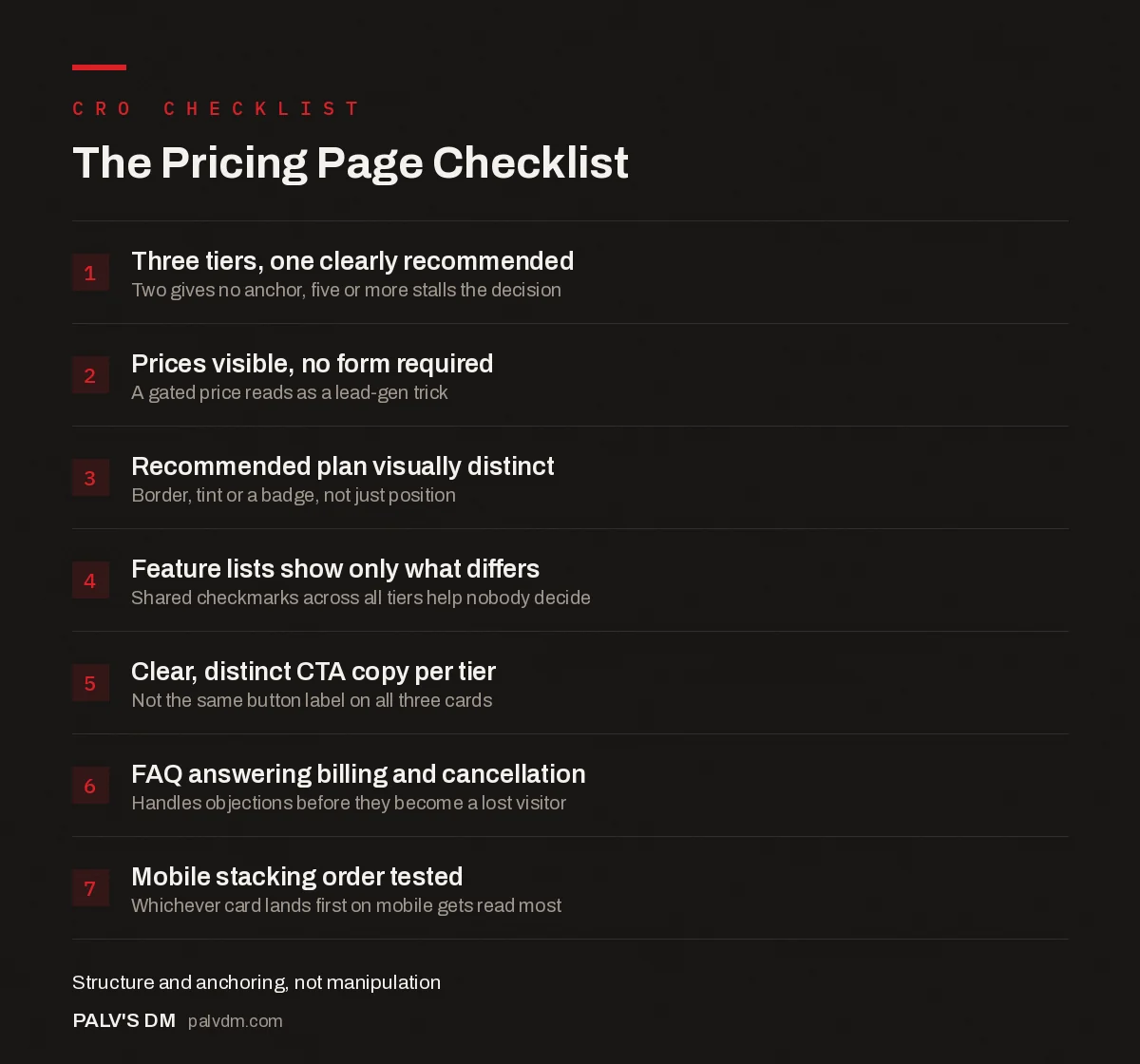
The Pricing Page Checklist
- Three tiers, one clearly recommended. Two gives no anchor, five or more stalls the decision.
- Prices visible, no form required. A gated price reads as a lead-gen trick.
- Recommended plan visually distinct. Border, tint or a badge, not just position.
- Feature lists show only what differs. Shared checkmarks across all tiers help nobody decide.
- Clear, distinct CTA copy per tier. Not the same button label on all three cards.
- FAQ answering billing and cancellation. Handles objections before they become a lost visitor.
- Mobile stacking order tested. Whichever card lands first on mobile gets read most.
Should you publish exact prices, or make people ask?
Publish them, or at minimum a tight range, in almost every case. “Request a quote” filters out exactly the wrong people: it keeps the tire-kickers who’ll fill out any form and loses the qualified buyer who wanted a number in the next ten seconds, not a callback in two business days. The exception is genuinely custom, high-variance work, where a single number would be misleading rather than helpful. Even then, a starting price (“plans start at”) anchors the conversation better than a bare contact form.
| Published pricing | “Request a quote” only | |
|---|---|---|
| Lead quality | Self-qualified before contact | Includes many unqualified leads |
| Sales cycle | Shorter; price objection handled up front | Longer; price often surfaces late and derails the deal |
| Best fit for | Standardised services and products | Genuinely custom, high-variance scopes |
| Main risk | Looking too expensive to a price-sensitive visitor who leaves | Losing the ready buyer who wanted a number now |
What actually goes inside each tier card?
Six elements, in this order, on every card that works well: the plan name, the price with billing frequency stated plainly (not “starting from” hiding a much higher real number), a one-line description of who the plan is for, a short feature list of what differs from the tier below it, a single clear CTA button, and, for the recommended tier only, the visual distinction that marks it as such. Cramming in every feature the plan includes, rather than just what changed, is the most common way a tier card turns into something nobody reads past the first three lines.
Button copy matters more than most redesigns give it credit for. “Get Started” on every single button across three tiers gives no signal about commitment level. “Start free trial,” “Talk to sales,” and “Buy now” each set a different expectation before the click happens, which reduces the number of people who bounce off a checkout flow they weren’t ready for.
Does this look different for a service business than a SaaS product?
Yes, in one important way. A SaaS pricing page can price by seats or usage tiers because the product scales predictably. A service business (an agency, a consultancy, a studio) is selling something with more variable delivery cost, so “three tiers” usually means three packages of scope, not three levels of the same product. That’s fine, and arguably clearer for the buyer, as long as each package states plainly what’s included and what triggers a move to the next one up. Where service businesses go wrong is copying the SaaS three-column layout without doing the harder work of actually defining what’s different about each package beyond the price.
What actually belongs above the fold?
The tier cards themselves, with prices visible, no scrolling and no clicking required to see a number. A one-line value statement above the cards (“Simple pricing, no setup fees” or similar, only if true) sets expectations before anyone reads a feature list. A billing toggle (monthly/annual), if you offer both, belongs here too, not buried lower where half your visitors won’t find it and will assume the higher monthly price is the only option.
What doesn’t belong above the fold: a hero image with no pricing information, a long explainer paragraph about your company’s philosophy, or a video that has to finish before the numbers appear. Visitors who reached a pricing page already know who you are. They came here for the number.
What mistakes actually hurt pricing page conversion?
- Burying the price behind a form. Even a short form (“enter your email to see pricing”) adds friction at the exact moment someone was ready to compare numbers, and it reads as a lead-gen trick rather than genuine pricing.
- Feature lists that don’t differentiate. If the same checkmark appears in all three columns, it’s not helping anyone decide. Only list what actually changes between tiers.
- No FAQ section addressing billing and cancellation. Questions about refunds, contract length, and what happens at a usage limit are exactly what stalls a ready buyer at the last step; answer them on the page, not after they’ve abandoned it.
- Treating the “Most Popular” badge as decoration. If it’s not actually your most-chosen plan, remove it. Buyers who later discover it was cosmetic don’t forget that.
- Ignoring mobile stacking order. When three columns collapse to one on a phone, whichever tier lands first gets read most. Make sure that’s the recommended plan, not the cheapest one by default.
Frequently asked questions
How many pricing tiers should a pricing page show?
Three works for most businesses: one entry option, one clearly recommended middle option, and one higher option that makes the middle look reasonable. Two tiers gives visitors nothing to anchor against, and five or more tiers usually causes hesitation rather than choice.
Is price anchoring manipulative?
Not inherently. Anchoring becomes manipulative when the higher-priced option is fake or deliberately unusable, existing only to make the middle option look better. It’s not manipulative when all tiers are genuinely useful and priced honestly for what they include; you’re just presenting real options in an order that helps people decide faster.
Should I publish exact prices or just ranges?
Exact prices, or a tight range, filter out unqualified leads before they book a call, which saves time on both sides. Ranges make sense when the service genuinely varies a lot by scope. “Contact us for pricing” with no other context is the option most likely to lose a visitor who was ready to buy.
Where should the recommended plan sit on the page?
Middle column on desktop, visually elevated with a border, a background tint, or a “Most Popular” label; second position when tiers stack vertically on mobile. Position alone does a lot of the anchoring work before anyone reads a word of copy.
Does a pricing page need an FAQ section?
Yes, almost always. Objections that would otherwise turn into a support email or a hesitant abandoned visit (billing cycles, cancellation terms, what happens at the tier limit) get answered on the page itself, right where the buying decision is happening.
Sources
- 9 Best Practices for a High-Converting Pricing Page, HubSpot
- How Anchoring Influences UX, Nielsen Norman Group
- Core Web Vitals: LCP, INP and CLS Explained Properly
- Should You Publish Your Prices? The Data and the Trade-Offs
- Why ‘Request a Quote’ Costs You Qualified Leads
- Landing Page Structure That Converts Cold Traffic
Want this done on your site?
Every PalV’s DM engagement starts with a free audit of your actual website — a 12-point
crawl covering what is blocking indexation, on-page gaps against your primary keywords, speed
findings, and the three to five fixes worth making first. Delivered in two working days. No
payment details, and the findings are yours whether you hire us or not.
Get your free SEO audit
See Web Development plans and prices