Landing Page Structure That Converts Cold Traffic
The section-by-section order that converts cold traffic on a landing page: headline, proof, form, and the elements worth cutting entirely.
A landing page built for cold traffic needs one goal, one CTA, and no navigation menu, with a benefit-led headline above the fold and every section after it earning its place toward that single conversion. Most underperforming landing pages don’t fail because the design is ugly. They fail because they’re trying to do three jobs at once: convert the visitor, educate them on the whole company, and let them browse around, and end up doing none of them well.
Cold traffic is unforgiving. Someone who clicked a paid ad or a cold email link doesn’t know your brand, doesn’t trust you yet, and has given you maybe eight seconds before deciding whether to keep reading. The structure of the page either respects that or fights it.
What should be above the fold?
Four things, in this order: a benefit-led headline, a one-sentence subheadline, a relevant hero visual, and the primary call to action. All four need to be visible without scrolling on a standard viewport, mobile included.
The headline should state the outcome, not describe the product category. “Get your website audited in 48 hours” beats “Professional SEO Audit Services” because it leads with what the visitor gets, not what you call yourselves internally. The subheadline earns its one sentence by answering “for whom” and “why this instead of the alternative,” under thirty words, no exceptions. If it takes two sentences to explain your value proposition, the value proposition isn’t clear yet.
Why cut the navigation menu?
This is the change that surprises people most, and it’s backed by real case studies, not just opinion. Unbounce cites double-digit conversion lifts from removing distractions like navigation, and a widely-cited VWO case study saw conversions double after a nav bar came off a landing page. The exact number moves around by industry and offer, but the direction never does. A nav bar exists to help visitors explore a site. A landing page exists to get one specific action taken. Those goals conflict, and every time they conflict, exploration wins the visitor’s attention away from the button you actually want clicked.
Strip the header navigation off a cold-traffic landing page and conversion usually climbs within the first week, no other design changes needed. It’s the cheapest test in conversion optimization: no redesign, no new copy, just deleting a menu bar. Clients resist it almost every time (“but what if they want to see our other pages”) and it’s almost always worth doing anyway, because a visitor who leaves via the nav bar wasn’t converting regardless.
What goes in the middle of the page?
Proof, in a specific order: three to five concrete proof points, then social proof, then objection handling. Here’s the structure that holds up across most offers.
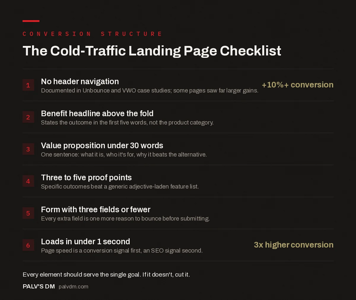
The Cold-Traffic Landing Page Checklist
- No header navigation: +10%+ conversion. Documented in Unbounce and VWO case studies; some pages saw far larger gains.
- Benefit headline above the fold. States the outcome in the first five words, not the product category.
- Value proposition under 30 words. One sentence: what it is, who it’s for, why it beats the alternative.
- Three to five proof points. Specific outcomes beat a generic adjective-laden feature list.
- Form with three fields or fewer. Every extra field is one more reason to bounce before submitting.
- Loads in under 1 second: 3x higher conversion. Page speed is a conversion signal first, an SEO signal second.
Proof points should read as outcomes, not adjectives. “Cut page load time from 4.2s to 1.1s” beats “Fast, reliable performance” because it’s specific enough to be verifiable. Vague superlatives read as marketing and get skimmed past; numbers read as evidence and get believed. For deeper detail on the exact elements that belong above that fold line, our guide to above-the-fold elements every service page needs covers layout patterns beyond what fits here.
How short should the form be?
Three fields or fewer for a top-of-funnel offer. Name, email, and at most one qualifying question if you genuinely need it to route the lead correctly. Every field past that is a small tax on submission rate, and most of what agencies collect upfront (company size, budget range, timeline) is better gathered on a call or in a second step, after someone has already said yes to the first ask.
If you need a longer form for legitimate qualification reasons, a multi-step form that shows three fields at a time typically outperforms one long form showing everything at once, because each visible step feels like a smaller commitment than the full list would.
What’s the right call to action?
Specific and low-friction, describing what happens next rather than a generic command. “Get my free audit” tells the visitor exactly what they’ll receive. “Submit” or “Learn more” tells them nothing and asks for trust you haven’t earned yet on a cold-traffic page. Repeat the CTA at least once more further down the page, using identical wording, so a visitor who scrolled past the first one without acting doesn’t have to scroll back up. For the copy itself, our guide on writing CTAs people actually click goes deeper into phrasing that converts versus phrasing that reads as noise.
Does mobile layout need a different structure entirely?
Treat mobile as the primary design, not an afterthought resize. Unbounce’s own conversion benchmark data, pulled from over 57 million conversions, found that 83% of landing page visits happened on mobile devices, yet desktop still converted about 8% better on average. That gap is a design problem, not an inevitability. It usually means the form is harder to fill on a small screen, the CTA button sits below a fold that’s much shorter on mobile, or body copy that reads fine on desktop turns into an unbroken wall of text on a phone.
Build the mobile version first, check that the CTA is reachable with a thumb without scrolling past three screens, and only then adapt up to desktop. Doing it the other way round, designing desktop and shrinking it down, is exactly how landing pages end up with that 8% gap instead of closing it.
Does page speed actually move the needle this much?
Yes, and it’s not a minor factor. Pages that load in around one second convert roughly three times better than pages taking five seconds. Cold traffic has no reason to wait; there’s no relationship built up yet that would make someone tolerate a slow page the way they might on a brand they already trust. A landing page with a heavy hero video or an unoptimized background image is quietly taxing every other optimization on the page before a visitor even reads the headline. Our detailed piece on page speed and conversion rate walks through the documented relationship in more depth, and Google’s own Core Web Vitals research backs the same pattern from the technical SEO side.
What should you actually cut?
- Autoplay video with sound. It competes with your headline for attention and mobile browsers often block it anyway, wasting the space it occupies.
- Multiple competing CTAs. “Buy now,” “Learn more,” and “Contact us” on the same page split intent three ways instead of concentrating it on one action.
- A carousel or slider. Almost nobody scrolls past the first slide. Whatever’s in slide two effectively doesn’t exist for most visitors.
- Long-form company history. Cold traffic doesn’t care when you were founded. Save that for the About page, not the conversion page.
Frequently asked questions
How long should a landing page be?
Long enough to answer every objection a cold visitor has, and not a word longer. For a low-consideration offer that could be three sections. For a high-ticket B2B service it might be ten. Length isn’t the metric that matters, whether every section is still earning its place is.
Should a landing page have navigation?
No, for a page built specifically to convert cold, paid or campaign traffic. Case studies from Unbounce and VWO both document double-digit conversion lifts from removing the header navigation, with some pages seeing far larger gains, because every nav link is an exit that isn’t the CTA.
What’s a good landing page conversion rate?
It depends heavily on traffic source and offer type, which makes a single benchmark number close to useless. A colder, higher-intent-mismatch source (cold outbound, broad display) will convert lower than a warm one (branded search, retargeting) even with an identical page. Compare your page against its own baseline, not an industry average.
How many form fields should a landing page have?
Three or fewer for a top-of-funnel offer: name, email, and maybe one qualifying question. Every additional field reduces submissions. If you need more information to qualify a lead, collect it after the initial conversion, in a follow-up call or a second-step form, not before someone has committed at all.
Does page speed really affect conversions that much?
Yes. Pages that load in about one second convert roughly three times better than pages taking five seconds, based on industry benchmark data widely cited in CRO research. Cold traffic has zero patience and zero loyalty, a slow load is often the first and only impression a visitor forms.
Sources
- Core Web Vitals and business metrics, web.dev (Google)
- Conversion Benchmark Report, Unbounce
- Landing page optimization case studies, VWO
- Core Web Vitals: LCP, INP and CLS Explained Properly
- Above-the-Fold Elements Every Service Page Needs
- Writing CTAs People Actually Click
- Page Speed and Conversion Rate: The Documented Link
Want this done on your site?
Every PalV’s DM engagement starts with a free audit of your actual website — a 12-point
crawl covering what is blocking indexation, on-page gaps against your primary keywords, speed
findings, and the three to five fixes worth making first. Delivered in two working days. No
payment details, and the findings are yours whether you hire us or not.
Get your free SEO audit
See Web Development plans and prices