Above-the-Fold Elements Every Service Page Needs
The exact elements a service page needs before the scroll: headline, proof, CTA, and the mistakes that quietly cost conversions.
A service page’s above-the-fold section needs an outcome-led headline, a one-line subheadline that adds specificity, a visible proof element, one clear primary call to action, and (for local or urgent services) a tappable phone number, all visible without scrolling on both desktop and mobile. Miss any one of these and you’re relying on visitors to scroll down and find the missing piece themselves, which most won’t.
Most service pages get this wrong the same way: they lead with the company name and a stock photo of a handshake. That tells a visitor nothing about what happens if they stay. The first screen has one job, convince someone this page is worth the next ten seconds, and everything on it should be judged against that job alone.
What actually counts as “above the fold” now?
The literal definition, whatever’s visible before scrolling, hasn’t changed, but the practical answer has, because there’s no longer one fold. A visitor on a 27-inch monitor sees a completely different amount of content than someone on a phone in portrait mode. Design for the smallest common viewport your analytics show real traffic on, not for your own desktop screen, and treat everything else as a bonus.
Check your own analytics before assuming. Most service businesses in India see the majority of organic traffic land on mobile first, which means the desktop hero section you and your designer keep tweaking might not even be the version most visitors ever see. Pull up your site on an actual mid-range Android phone, not a browser dev tool set to “mobile view,” and look at what’s genuinely visible before the first scroll.
What elements does the section actually need?
Run your current service page against this list. Every item earns its place because it answers a specific question a visitor is silently asking in the first few seconds.
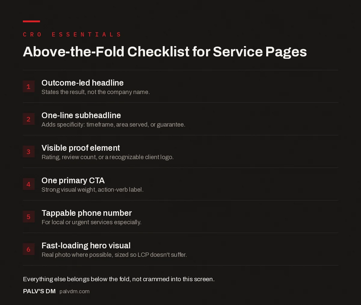
Above-the-Fold Checklist for Service Pages
- Outcome-led headline. States the result, not the company name.
- One-line subheadline. Adds specificity: timeframe, area served, or guarantee.
- Visible proof element. Rating, review count, or a recognizable client logo.
- One primary CTA. Strong visual weight, action-verb label.
- Tappable phone number. For local or urgent services especially.
- Fast-loading hero visual. Real photo where possible, sized so LCP doesn’t suffer.
How much should you actually cram into that space?
Less than most business owners want to. The instinct is to list every service, every credential, every award in the hero section because it all feels important. It isn’t, not here. A headline, a subheadline, one proof element, and one CTA cluster is enough. Everything else, the full service list, the detailed credentials, the longer story, belongs in the sections a visitor reaches after the hero has already earned their attention.
A well-defined visual hierarchy matters more than volume of information. Size, weight, and spacing should point the eye at the headline first, the CTA second, and the proof element third. If everything on the screen is fighting for the same attention, nothing wins.
What’s different about mobile specifically?
Mobile above-the-fold is smaller and it’s where most of your traffic probably lands first for a local service business. The trust bar and CTA that sit comfortably beside the headline on desktop usually have to stack below it on mobile, so decide the order deliberately: headline, then CTA, then trust signal is a defensible default, since a visitor who’s already convinced by the headline shouldn’t have to scroll past a testimonial to find the button.
Sticky mobile CTAs, a call or book-now bar fixed to the bottom of the screen, solve a real problem here: once a visitor scrolls past the hero, the CTA that was above the fold disappears with it unless you deliberately keep one accessible. Keep that sticky bar to a single action, though. A sticky footer crowded with three buttons defeats its own purpose, since it’s competing with itself for the same thumb.
What mistakes show up most on service pages specifically?
- Leading with the company name instead of the outcome. “Sharma Electrical Services, Since 1998” is not a headline. “Licensed Electrician, Same-Day Callouts Across Ahmedabad” tells the visitor what they get.
- A generic stock photo doing no work. A photo of your actual team, van, or workspace builds more trust than a stock image of a smiling actor in a hard hat, even if the stock photo has better lighting.
- Burying the price or the “starts at” figure below the fold on a page whose whole traffic intent is comparison shopping. If people are searching with “cost” or “price” in the keyword, hiding pricing signals above the fold works against the exact intent you ranked for.
- Two CTAs of equal visual weight competing for the same click. “Get a Quote” and “Learn More” side by side, same size, same color, forces a decision the visitor didn’t come to make.
- A hero image so large it delays the actual content. If the largest visible element takes a second and a half to render, that’s the element Google is measuring for Largest Contentful Paint, and it’s failing on your own homepage.
What does a good one actually look like assembled?
Take a plumbing business as a working example. The headline reads “24/7 Emergency Plumber, Ahmedabad, Arriving Within the Hour,” not “Welcome to Patel Plumbing Services.” The subheadline underneath adds one more useful fact: “Licensed, insured, upfront pricing before we start work.” Below that sits a proof line, “4.8 stars from 340+ Google reviews,” small but legible, not buried in a carousel that needs a click to reveal. Then the CTA cluster: a large “Call Now” button with the number visible as text (not hidden behind a click), and a slightly smaller “Book Online” as the secondary option for visitors who’d rather not talk to anyone yet.
None of that is complicated. What makes it work is restraint: four elements, each answering one question, arranged so the eye knows exactly where to land first. Compare that to a hero section listing eleven services, three certifications, a mission statement, and a stock photo of a wrench, which is what a lot of service pages still ship with.
How do you know if yours is actually working?
Don’t rely on opinion, yours or a client’s. A five-second test works well here: show the page to someone unfamiliar with the business for five seconds, then ask what the business does and what they’d do next. If they can’t answer both, the hero section isn’t doing its job regardless of how it looks.
Beyond that, scroll-depth tracking in GA4 tells you what percentage of visitors never make it past the first screen, which is a reasonable proxy for whether the hero earned continued attention. Session recordings add the qualitative layer: watching where the cursor hesitates in the first few seconds of a real visit tells you more than any amount of internal debate about button color.
How does this connect to page speed?
Directly, and it’s the part most CRO advice skips. Whatever renders as the largest element in that first screen, usually a hero image or the H1 itself, is what search engines measure for Largest Contentful Paint. A beautifully designed above-the-fold section that takes four seconds to fully render is actively working against you twice: once on the conversion side, because visitors bail before it finishes loading, and once on the SEO side, because a failing LCP score is a documented part of Google’s page experience signals. Compress the hero image, set explicit width and height so the layout doesn’t shift while it loads, and test the real load time on a throttled mobile connection, not your office Wi-Fi.
Frequently asked questions
Does above-the-fold still matter if people are willing to scroll?
Yes, but not because visitors refuse to scroll. It matters because the first screen decides whether they bother to. If a visitor can’t tell what the page offers within a couple of seconds, most leave before finding a good answer further down.
Should the phone number be above the fold on a service page?
For local and urgent services, plumbing, HVAC, locksmiths, legal consultations, yes, prominently. A visible, tappable phone number captures the segment who want to talk to a person immediately rather than fill out a form and wait.
How many CTAs should be above the fold on a service page?
One primary CTA with strong visual weight, plus a lighter secondary option if it serves a genuinely different intent, like Call Now next to Get a Free Quote. Two CTAs of equal weight force a decision the visitor didn’t come to make.
What’s the biggest above-the-fold mistake on service pages specifically?
A headline that describes the company instead of the outcome. It tells a visitor nothing about what problem gets solved or how fast. The company name belongs in the logo, not the H1.
Does the above-the-fold section affect Core Web Vitals?
Directly. Whatever renders as the largest visible element, usually a hero image or heading, is almost always what Google measures for Largest Contentful Paint. An unoptimized hero image is one of the most common causes of a failing LCP score on service pages.
Sources
- Mastering Above the Fold: How to Encourage Scrolling and Converting, CXL
- Hero Section Examples That Convert, Omniconvert
- Above-the-Fold Content: Answering Before Scrolling
- Landing Page Structure That Converts Cold Traffic
- Writing CTAs People Actually Click
- Trust Signals That Work in the Indian Market
Want this done on your site?
Every PalV’s DM engagement starts with a free audit of your actual website — a 12-point
crawl covering what is blocking indexation, on-page gaps against your primary keywords, speed
findings, and the three to five fixes worth making first. Delivered in two working days. No
payment details, and the findings are yours whether you hire us or not.
Get your free SEO audit
See Web Development plans and prices