Writing CTAs People Actually Click: A Practical Method
Generic CTA copy like Submit or Learn More gets ignored. Here's a step-by-step method for writing CTAs that tell people exactly what happens next.
A CTA that converts tells the visitor exactly what happens the second they click, in language specific to what’s actually on the other side of the button. “Submit” and “Learn More” fail this test, they describe nothing. The fix isn’t a trick or a magic word list, it’s a five-step process you can run on any button in about ten minutes.
Most CTA advice stops at “use action verbs,” which is true and also not nearly enough to fix a weak button. Here’s the fuller method, the reasoning behind each step, and where the advice actually breaks down in practice.
Step 1: Name the exact action, not the category of action
Start by writing down, in plain language, what actually happens after the click. Not “they submit a form”, what specifically do they get or do next? “They book a fifteen-minute call with me” is specific. “They fill out a lead form” describes the mechanism, not the outcome, and visitors don’t care about the mechanism. If you can’t state the exact outcome in one sentence, that’s usually a sign the offer behind the button isn’t clear yet either, and no amount of button copy fixes an unclear offer.
Step 2: Lead with a verb, then attach the specific value
“Get your free SEO audit” beats “Free SEO Audit” as a button label because it opens with an action, not a noun. The visitor’s brain processes a verb-first button faster as an instruction rather than a label. Pair the verb directly with what makes this specific offer worth clicking, not a generic noun. “Get your audit” is fine. “Get your audit” that’s free, delivered in two days, and comes with no payment details attached is a better sentence to have already established above the button, so the button itself can stay short.
Step 3: Cut every word that doesn’t change the decision
Once you have a draft, read it and ask of each word: does removing this change whether someone clicks? “Click here to get started now” has four words doing no work: “click here” (they already know how buttons work), “to”, and arguably “now” if there’s no real urgency. “Get started” is what’s left, and it’s still generic. Push further: get started with what? “Start your free trial” survives the cut because every word is carrying weight.
Step 4: Match the CTA to how far along the visitor is
A first-time visitor on a blog post isn’t ready for “Buy Now.” A returning visitor who’s already read your pricing page might be. This is where a lot of CTA copy fails silently, it’s technically well-written but pitched at the wrong stage of the decision. TOFU content should offer something low-commitment: a guide, a checklist, a free audit. BOFU pages, pricing pages, comparison pages where someone’s actively deciding, can carry a more direct ask like “Start my project” or “Book a call.”
The five-step CTA method, in order
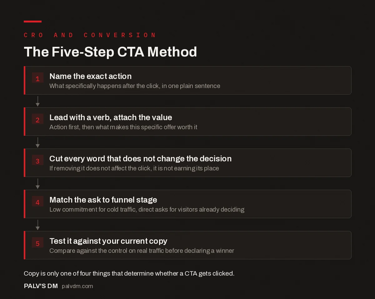
The Five-Step CTA Method
- Name the exact action. What specifically happens after the click, in one plain sentence.
- Lead with a verb, attach the value. Action first, then what makes this specific offer worth it.
- Cut every word that doesn’t change the decision. If removing it doesn’t affect the click, it’s not earning its place.
- Match the ask to funnel stage. Low commitment for cold traffic, direct asks for visitors who are already deciding.
- Test the button against a plain control. Compare against your current copy on real traffic before declaring a winner.
Step 5: Test it against your current copy, don’t assume
Even a CTA that follows every rule above is still a guess until traffic proves it. Run an A/B test if you have enough volume for the result to mean anything, generally a few hundred conversions per variant before you can trust the outcome. If your traffic is too low for a statistically sound test, and for most small business sites, it is, don’t fake confidence with a two-week test on forty clicks. Change the copy based on the reasoning above, watch the trend over a longer window, and be honest that you’re making an informed judgment call, not reading a definitive result.
What actually kills a CTA’s performance, beyond the words
- Visual contrast. A perfectly worded button in a colour that blends into the page background won’t get clicked regardless of copy quality.
- Placement below the point of decision. If the CTA sits below where a visitor has already decided to leave, no copy fixes that. Place it where the “yes, but” objection has just been answered.
- Too many competing CTAs on one page. Three different buttons asking for three different actions splits attention and usually drops the conversion rate on all three.
- A mismatch between the CTA and what’s actually next. A button that says “Get Instant Access” that then leads to a form asking for a phone number before anything is delivered breaks the promise the copy just made, and that mismatch costs more trust than a boring CTA ever would.
- A touch target that’s too small on mobile. Google’s Material Design guidance recommends touch targets of at least 48 by 48 density-independent pixels, roughly a fingertip’s width. A perfectly worded button that’s smaller than that on a phone screen gets missed or mis-tapped, and no amount of copy work fixes a physically hard-to-hit button.
None of these four are copywriting problems, and no amount of rewording the button text solves them. Worth checking before you spend another hour rewriting words that were never the actual issue.
Do first-person CTAs really outperform second-person ones?
This gets asked constantly, and the honest answer is: it depends, and not by as much as the confident blog posts claim. “Get my template” versus “Get your template” has been tested by multiple UX and CRO teams over the years with mixed, context-dependent results, not a consistent universal winner either direction. What’s more reliably true is that specificity beats person: “Get my template” beats “Submit,” but whether it also beats “Get your template” varies by audience and brand tone enough that we test both when a client has the traffic to support it, rather than picking one on principle.
For B2B service pages specifically, in our experience running these tests for consulting and agency clients, second person tends to read more professional, while first person tends to edge out in ecommerce and lead-magnet contexts where a more personal tone fits. Neither rule is absolute enough to skip testing on a page that matters.
Generic versus specific: the same button, rewritten
| Page type | Generic CTA | Rewritten with the method above |
|---|---|---|
| Blog post, cold traffic | Learn More | Get the Free SEO Audit |
| Pricing page | Submit | See My Custom Quote |
| Newsletter signup | Subscribe | Get One Note a Month, No Spam |
| Consultation booking | Contact Us | Book a 15-Minute Call |
| Software free trial | Get Started | Start My Free 14-Day Trial |
| WhatsApp lead form | Click Here | Chat With Us on WhatsApp |
Notice the pattern across every row: the rewritten version answers a question the generic version leaves open. What will I learn? What am I submitting for? What am I subscribing to, and how often? That’s the entire method compressed into six examples, and it’s a useful gut check to run against any button you’re about to ship.
Does this apply the same way to WhatsApp and call-based CTAs?
Mostly yes, with one addition. Indian audiences convert heavily through WhatsApp and phone calls rather than forms, so a CTA promising “Chat With Us on WhatsApp” or “Call Now” needs to be honest about response time if you want repeat trust. If someone clicks expecting an instant reply and gets one twelve hours later, that’s a broken promise the same way a slow-loading “instant access” page is. Set the expectation in the microcopy under the button, “usually replies within the hour,” if that’s true, rather than letting the CTA imply a speed you can’t deliver.
Frequently asked questions
Should CTA buttons use first person or second person?
Both work, and the honest answer is it depends on your audience enough that testing beats guessing. First person (“Get my audit”) tends to feel more personal and has performed well in several publicly documented tests. Second person (“Get your audit”) reads more natural in some brand voices. Neither is universally correct.
Is ‘Learn More’ really a bad CTA?
It’s vague rather than wrong. It doesn’t tell the visitor what they’ll learn or what happens after they click, which is the core job of a CTA. It’s not going to tank a page on its own, but replacing it with something specific to what’s actually behind the button almost always helps, and it costs nothing to test.
How long should a CTA button’s text be?
Short enough to read in under a second, typically two to five words. Longer than that and it starts competing with the surrounding copy for attention instead of standing apart from it. If you need more than five words to explain the action, that’s usually a sign the supporting copy above the button isn’t doing its job.
Does urgency language like ‘Now’ or ‘Today’ actually help?
It can, when the urgency is real, a genuine deadline or limited slot count. Applied to something with no actual time pressure, like a permanently available free consultation, it reads as manufactured and can undercut trust more than it drives clicks. Use urgency only where the underlying constraint is true.
Sources
- “Get Started” Stops Users, Nielsen Norman Group
- Better Link Labels: 4Ss for Encouraging Clicks, Nielsen Norman Group
- Landing Page Structure That Converts Cold Traffic
- Microcopy That Removes Friction at the Point of Decision
- Above-the-Fold Elements Every Service Page Needs
- Trust Signals That Work in the Indian Market
Want this done on your site?
Every PalV’s DM engagement starts with a free audit of your actual website — a 12-point
crawl covering what is blocking indexation, on-page gaps against your primary keywords, speed
findings, and the three to five fixes worth making first. Delivered in two working days. No
payment details, and the findings are yours whether you hire us or not.
Get your free SEO audit
See Web Development plans and prices