
Comparison Pages: Structuring Them to Rank and Convert
A comparison page that ranks and converts opens with a verdict, leads with a real HTML table, and substantiates every claim criteria by criteria — including the favoured option's weaknesses.

A comparison page that ranks and converts opens with a direct verdict in the first 100 words, follows immediately with a real HTML table covering the criteria buyers actually weigh, and then substantiates every row with a dedicated section of honest analysis — including the option’s weaknesses, not just its strengths. Pages that skip straight to a sales pitch, or that bury the actual comparison under paragraphs of brand history, lose both the search visibility and the reader’s trust that the format exists to earn.
Comparison pages sit at commercial intent, meaning the visitor has already narrowed the field and is deciding, not discovering. That changes what “good” looks like: speed to the verdict matters more than exhaustive scene-setting, and credibility matters more than persuasion.
What makes a comparison page different from a regular guide?
A standard guide teaches a concept; a comparison page helps someone choose between named alternatives. The intent signal is explicit — a query like “X vs Y” or “best X for Y” tells you the reader already knows the category and wants a decision aid, not an introduction. Google’s guidance on creating helpful, reliable, people-first content applies the same E-E-A-T standard here as anywhere else: demonstrated experience and honest coverage of trade-offs read as more helpful than a comparison built entirely from marketing copy on each option’s own website.
How should a comparison page be structured?
| Section | Purpose | Length |
|---|---|---|
| Opening verdict | Answer “which one” before anything else | 40-80 words |
| Comparison table | Scannable, criteria-by-criteria view | 3-6 rows, 2-4 columns |
| Criteria sections | Substantiate each table row with real analysis | 150-300 words each |
| Who each option suits | Segment the verdict by use case | 1 short paragraph per option |
| FAQ | Handle the remaining objections and edge cases | 3-6 Q&As |
The order matters as much as the content. A verdict that arrives after 800 words of context has already lost the reader who came to decide quickly, and it’s arrived too late for a snippet or AI Overview extraction pass to use it either.
What criteria belong in the comparison table?
The criteria should mirror how a buyer actually evaluates the options, not an arbitrary feature checklist. For most B2B or service comparisons, that means price or pricing model, the core capability gap between the options, implementation or onboarding effort, and support or reliability. Padding the table with minor features to make it look thorough dilutes the rows that actually drive the decision.
How do you keep a comparison page from reading like a sales pitch?
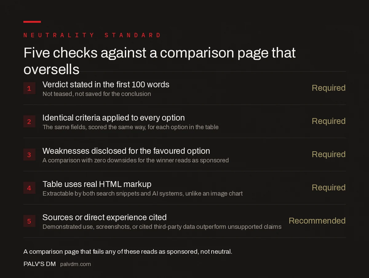
Five checks against a comparison page that oversells
- Verdict stated in the first 100 words — Required. Not teased, not saved for the conclusion.
- Identical criteria applied to every option — Required. The same fields, scored the same way, for each option in the table.
- Weaknesses disclosed for the favoured option — Required. A comparison with zero downsides for the winner reads as sponsored, not neutral.
- Table uses real HTML markup — Required. Extractable by both search snippets and AI systems, unlike an image comparison chart.
- Sources or direct experience cited — Recommended. Demonstrated use, screenshots, or cited third-party data outperform unsupported claims.
The single most common failure mode is a table with identical-looking rows where the favoured option somehow scores well on every criterion. Readers notice this pattern quickly, and so does anyone fact-checking the page against the actual products — it’s the fastest way to lose the trust a comparison format is supposed to build.
How does search intent affect which keywords to target?
Commercial-intent keywords — “X vs Y,” “X alternatives,” “best X for [use case]” — belong on a comparison page. Purely informational keywords about how a category works belong on a guide instead, and forcing them onto the same page dilutes both. A page trying to rank for “what is a CDN” and “Cloudflare vs Fastly” simultaneously usually serves neither query well, because the reader arriving for the first query isn’t ready for the second, and vice versa. Splitting them, then choosing the right page type for each, keeps the comparison page focused on its actual job: helping someone choose.
What goes above the comparison table?
As little as possible before the verdict. One or two sentences establishing what’s being compared and for whom is enough context — a full paragraph of scene-setting before the actual comparison starts is the single easiest thing to cut from an underperforming comparison page. Readers who search “X vs Y” already know what X and Y are; they don’t need them re-introduced.
Frequently asked questions
What structure should a comparison page follow?
Open with a verdict in the first 100 words, follow immediately with a real HTML comparison table covering the criteria buyers actually weigh, then substantiate each row with a dedicated section of genuine analysis. This answer-first structure serves both readers scanning quickly and search or AI systems extracting the comparison.
Should a comparison page favour one option?
It can, as long as the reasoning is transparent and the criteria are applied consistently to every option, including the one being recommended against. A comparison that only lists strengths for the favoured option and only weaknesses for alternatives reads as a sales page, which hurts both trust and conversion.
How long should a comparison page be?
Long enough to substantiate every row in the comparison table with real analysis, typically 1,500 words or more once the table is followed by criteria-by-criteria sections. Length isn’t the goal; every additional paragraph should back a specific claim already made in the table.
Does a comparison page need first-hand experience with both options?
It should, or it should clearly cite the sources the comparison relies on. Google’s guidance on helpful content specifically calls out demonstrated experience as part of E-E-A-T, and a comparison written without ever having used either option reads thinner than one grounded in direct use or well-sourced research.
Sources
- Creating Helpful, Reliable, People-First Content — Google Search Central
- E-A-T Gets an Extra E for Experience — Google Search Central Blog
- On-Page SEO Checklist: The Complete Working List
- Landing Page SEO vs Blog Post SEO: Different Jobs
- Above-the-Fold Content: Answering Before Scrolling
Want this done on your site?
Every PalV’s DM engagement starts with a free audit of your actual website — a 12-point
crawl covering what is blocking indexation, on-page gaps against your primary keywords, speed
findings, and the three to five fixes worth making first. Delivered in two working days. No
payment details, and the findings are yours whether you hire us or not.