
Mobile Conversion Rate: What Actually Breaks on a 5-Inch Screen
Mobile conversion rate lags desktop by nearly half. See why: slow load times, cramped forms, undersized tap targets, and what fixes each one.

Mobile conversion rate sits at roughly 2% to 2.5% across most ecommerce benchmarks, against 3.5% to 4% on desktop, and the gap has nothing to do with mobile users caring less. It comes down to five specific failure points that show up on a 5-inch screen and mostly don’t on a 15-inch one: load speed, form length, tap target size, checkout friction, and how much trust-building content survives the squeeze down to mobile.
Mobile now drives 70% or more of ecommerce traffic on most sites, yet still converts at roughly half the desktop rate. That’s not a small gap to shrug off. It’s the majority of your visitors converting at the worse of your two rates, which makes mobile the highest-value place to spend CRO effort on most sites, not desktop.
Why does mobile convert worse than desktop in the first place?
Most sites are built desktop-first, then squeezed down to mobile through a responsive framework rather than designed for the smaller screen from the start. Checkout flows built around a wide multi-column form look cramped and confusing stacked vertically. Trust signals like testimonials, security badges and detailed product information often get cut or buried below the fold to save space, right when mobile users need more reassurance, not less, because they can’t inspect a product as thoroughly as they could in person or on a bigger screen.
There’s also a genuine intent difference. A chunk of mobile traffic is research browsing on a commute or during a break, never intended to convert on that visit. That’s real, but it explains only part of the gap. Fix the friction points and the honest conversions among mobile visitors who did intend to buy go up regardless.
What actually breaks between desktop and mobile?
Here’s where the gap actually opens up, based on the failure points that show up repeatedly across usability research and our own site audits.
Mobile vs Desktop: Where Conversions Leak
| Factor | Desktop | Mobile |
|---|---|---|
| Typical conversion rate | 3.5% to 4% | 2% to 2.5% |
| Cart abandonment | 67% to 70% | 79% to 85% |
| Form field friction | Low, full keyboard, larger fields | High, on-screen keyboard swaps, autocorrect, small fields |
| Impact of a 0.1s speed gain | Measurable but smaller | Up to 8.4% conversion lift (retail) |
| Minimum usable tap target | Not applicable, cursor-based | 48x48px per Google’s guidelines |
Two rows on that table do most of the damage in practice: cart abandonment and form friction. They’re connected. A cramped mobile checkout form is exactly where an already-hesitant mobile shopper decides the purchase isn’t worth the hassle.
How much does page speed alone move mobile conversions?
More than almost any single design change you could make. Google and Deloitte’s “Milliseconds Make Millions” study, based on 30 million mobile sessions across 37 brands, found that a 0.1-second improvement in mobile load speed increased retail conversions by 8.4% and average order value by 9.2%. For lead generation pages specifically, the same 0.1-second gain lifted form submissions by 8.3%.
That’s not a typo. A tenth of a second. Mobile networks and lower-powered devices amplify every inefficiency that a fast desktop connection quietly absorbs: an unoptimised hero image, a render-blocking script, a font that hasn’t loaded yet all cost real conversions on mobile in a way they barely register on desktop.
What’s actually wrong with most mobile checkout forms?
The same form that takes fifteen seconds to fill on desktop can take a minute or more on mobile once you account for keyboard switching between letters and numbers, autocorrect fighting with address fields, and fat-finger errors on cramped inputs. Every additional field compounds this. A few fixes carry outsized weight:
- Cut every non-essential field. Ask for what you need to fulfil the order, not what would be nice to have for your CRM.
- Enable autofill properly. Correct input types (email, tel, postal-code) let the mobile keyboard and browser autofill do the work instead of the user.
- Never force account creation before checkout. Offer it as an option after the order completes, when there’s no longer a reason for the customer to abandon over it.
- Show progress on multi-step checkouts. A visible step count reduces the “how much more of this is there” abandonment that unstructured long forms invite.
Are sticky mobile CTAs and bottom navigation worth using?
Generally yes, on transactional pages specifically. A sticky “Add to Cart” or “Book Now” bar anchored to the bottom of the screen keeps the primary action reachable without scrolling back up, which matters more on mobile than desktop simply because thumb reach is limited on a tall page. The trade-off is screen real estate: a sticky bar permanently eats into your content area, so it earns its place on product and service pages with one clear action, and it’s usually wrong on content or blog pages where it just gets in the way of reading.
Does a responsive theme automatically fix mobile conversion problems?
No, and this is the assumption that trips up more site owners than any other on this list. Responsive design solves layout. It reflows columns into rows and shrinks images to fit the viewport. It does nothing about form length, checkout step count, tap target sizing, or whether your hero image is a 4MB file that a lightweight theme still has to download over a patchy mobile connection. A site can be perfectly responsive and still convert badly on mobile because responsiveness was never the actual problem.
Payment method matters more here than most Western CRO guides account for. On Indian ecommerce checkouts specifically, offering UPI and cash-on-delivery alongside card payment consistently reduces mobile abandonment, because a meaningful share of mobile shoppers either don’t have a card handy on their phone or simply prefer not to enter one. A checkout that only accepts card payment is quietly filtering out buyers before they ever reach the “pay” button, and it shows up as a mobile conversion problem when the real cause is a payment options problem.
Do trust signals need to look different on mobile?
Yes. What reads as reassuring on a wide desktop layout, three testimonials in a row, a row of payment logos, a visible phone number in the header, often gets compressed to a single line or dropped entirely on mobile to save vertical space. That’s backwards. Mobile shoppers, buying on a smaller screen with less ability to inspect product detail, need at least as much reassurance as desktop shoppers, not less. Keep one strong trust element visible near the primary CTA on mobile rather than burying all of them in a footer nobody scrolls to.
Mobile conversion audit checklist
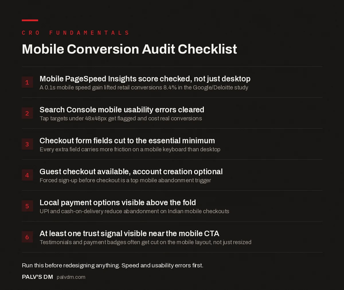
Mobile Conversion Audit Checklist
- Mobile PageSpeed Insights score checked, not just desktop. A 0.1s mobile speed gain lifted retail conversions 8.4% in the Google/Deloitte study.
- Search Console mobile usability errors cleared. Tap targets under 48x48px get flagged and cost real conversions.
- Checkout form fields cut to the essential minimum. Every extra field carries more friction on a mobile keyboard than desktop.
- Guest checkout available, account creation optional. Forced sign-up before checkout is a top mobile abandonment trigger.
- Local payment options visible above the fold. UPI and cash-on-delivery reduce abandonment on Indian mobile checkouts.
- At least one trust signal visible near the mobile CTA. Testimonials and payment badges often get cut on the mobile layout, not just resized.
Where should you actually start fixing this?
Start with your mobile PageSpeed Insights score and your Search Console mobile usability report before touching layout or copy. Speed and tap-target errors are objectively measurable and directly tied to conversion data from the Google/Deloitte study above. Design opinions about what “feels cramped” are useful but subjective, and it’s easy to spend weeks polishing a checkout flow while a 4-second LCP quietly caps every improvement you make on top of it.
Once speed and usability errors are cleared, watch a real session recording of someone checking out on mobile before changing anything else. Ten minutes of watching actual thumbs miss actual buttons will reprioritise your fix list faster than any amount of debate in a meeting room.
Frequently asked questions
What is a good mobile conversion rate?
Industry benchmarks put a solid mobile ecommerce conversion rate around 2.5% to 3%, roughly half to two-thirds of typical desktop rates of 3.5% to 4%. Anything meaningfully below 2% on mobile, with desktop performing normally, points to a mobile-specific problem worth auditing.
Why does mobile convert worse than desktop if most traffic is mobile?
Most sites are still designed desktop-first and adapted down, so checkout flows, forms and trust signals get squeezed into a smaller screen rather than built for it. Mobile also carries more distracted, on-the-go browsing sessions that were never going to convert on that visit regardless of design.
Does page speed really matter that much for mobile conversions?
Yes, more than almost any other single factor. Google and Deloitte’s joint study across 37 brands found a 0.1-second improvement in mobile load speed lifted retail conversions by 8.4% and average order value by 9.2%. Speed compounds because slow pages also raise bounce before the design even gets evaluated.
Should every mobile checkout support guest checkout?
Yes, forcing account creation before checkout is one of the most consistently cited mobile abandonment triggers in usability research. Offer account creation as an option after the order completes, when the customer already has the product and less reason to abandon.
How big should mobile buttons and tap targets be?
Google’s web.dev guidelines recommend a minimum of 48×48 device-independent pixels for any tap target, with at least 8px of spacing between adjacent targets. Search Console flags smaller targets as mobile usability errors, and they measurably increase mis-taps and abandonment.
Sources
- Milliseconds Make Millions study, Think with Google
- Accessible tap targets, web.dev by Google
- Core Web Vitals: LCP, INP and CLS Explained Properly
- Page Speed and Conversion Rate: The Documented Link
- Form Length vs Lead Quality: Finding the Balance
- Writing CTAs People Actually Click
Want this done on your site?
Every PalV’s DM engagement starts with a free audit of your actual website — a 12-point
crawl covering what is blocking indexation, on-page gaps against your primary keywords, speed
findings, and the three to five fixes worth making first. Delivered in two working days. No
payment details, and the findings are yours whether you hire us or not.
Get your free SEO audit
See Web Development plans and prices