Writing for Skimmers Without Dumbing Content Down
Scannable content is not simplified content. Here is how to format for skimmers -- headers, tables, short paragraphs -- without cutting real depth.
Published: August 2026
Scannable content is not simplified content — it’s the same depth and nuance, arranged so a reader can find what they need without reading every word. Nielsen Norman Group’s long-running eye-tracking research on web reading has consistently found that most visitors scan a page before deciding whether to read it closely, which means formatting isn’t decoration on top of good writing, it’s part of whether the writing gets read at all. This guide covers how to structure content for scanners without stripping out the substance that makes it worth reading in the first place.
The mistake most teams make is treating “scannable” and “in-depth” as opposites, so they either write a shallow, choppy post that scans well but says little, or a dense, well-researched post that scanners bounce off before reaching the good part. Both are avoidable with the same set of formatting habits.
Why does scannability matter if a reader ultimately reads closely anyway?
Scanning is how readers decide whether to read closely at all. A page that fails the scan — dense paragraphs, vague headers, no visual entry points — loses readers before they ever discover the depth underneath. The scan is a gate, not a substitute for reading; formatting well doesn’t replace substance, it’s what gets substance actually consumed.
This matters even more for returning or reference use. A reader who found a guide useful once often comes back to find one specific section, not to reread the whole thing. If that section isn’t locatable through headers and structure alone, the content’s long-term value drops even if the original read-through was good.
What formatting habits make content genuinely scannable?
| Element | What it does for scanners |
|---|---|
| Question-style H2s | Let a reader match their exact question to a section without reading the section itself |
| Short paragraphs (2-4 lines) | Reduce the visual wall-of-text effect that makes readers skip a section entirely |
| Bolded key terms mid-sentence | Give the eye landing points while skimming a paragraph, not just headers |
| Tables for comparable data | Let readers extract specific numbers without parsing sentences |
| Bullet lists for parallel items | Signal “these are options/steps,” which is faster to process than the same items in prose |

Scannable vs Dumbed-Down Content
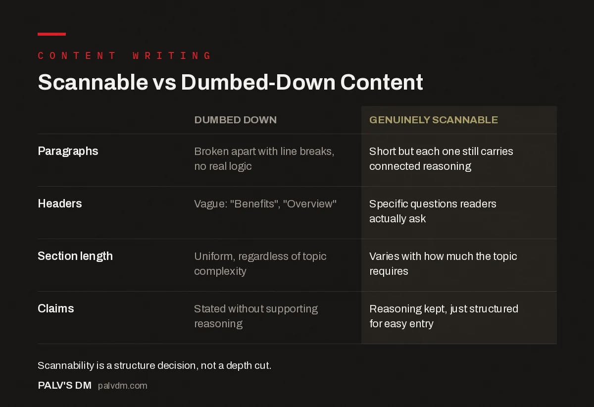
| Dumbed down | Genuinely scannable | |
|---|---|---|
| Paragraphs | Broken apart with line breaks, no real logic | Short but each one still carries connected reasoning |
| Headers | Vague: “Benefits”, “Overview” | Specific questions readers actually ask |
| Section length | Uniform, regardless of topic complexity | Varies with how much the topic requires |
| Claims | Stated without supporting reasoning | Reasoning kept, just structured for easy entry |
How do you keep scannable formatting from flattening nuance?
The risk with heavy formatting is that genuine complexity gets forced into a bullet list or short paragraph that can’t actually hold it, producing a series of oversimplified claims instead of one well-reasoned one. The fix isn’t to abandon formatting, it’s to match the format to the idea’s actual shape.
- Use prose for reasoning, not lists. If an idea has genuine “because” logic connecting its parts, a paragraph carries that connective tissue better than a bullet list, which flattens everything to the same visual weight.
- Use lists for genuinely parallel items. Steps in a process, options at the same decision point, criteria in a comparison — these are naturally list-shaped and lose nothing by being formatted that way.
- Let sections vary in depth. Not every H2 needs the same length. A section answering a simple question can be three sentences; one unpacking a genuinely complex trade-off can run several paragraphs. Forcing uniform section length is what produces artificial simplicity.
How does scannable structure interact with SEO and AI citation?
Question-style headers, short self-contained sections, and tables all happen to be exactly what both search engines extracting featured snippets and AI systems generating summaries look for — a clean, quotable unit of text tied to a specific question. This isn’t a coincidence: both scanning humans and extraction algorithms are solving a similar problem, finding the specific answer inside a longer document without reading all of it.
The practical implication is that formatting for human scanners and formatting for machine extraction are close to the same task. A section that a human can understand in isolation, without needing the surrounding paragraphs for context, is also a section an AI system can lift cleanly into a generated answer.
What are the warning signs that content has been over-simplified, not just formatted well?
- Bullet points that were clearly a paragraph before someone broke the sentences apart with line breaks, not genuinely parallel items
- Headers so short they’ve lost the specificity that made them useful (“Benefits” instead of “What does faster page load actually save in bounce rate?”)
- Claims stated without their supporting reasoning, because the reasoning didn’t fit the format
- Every section roughly the same length regardless of how much the topic actually requires
If a piece of content shows several of these at once, it’s optimised for looking scannable rather than for actually helping either a scanner or a close reader.
How does this differ for mobile readers?
Mobile readers scan more aggressively than desktop readers, mostly because the smaller viewport means less content is visible at once and scrolling has a real cost in attention. Paragraphs that look reasonably short on a desktop monitor can stretch across six or seven lines on a phone screen, which changes how they read even though the underlying text hasn’t changed at all.
The practical adjustment is to write with the narrower viewport in mind rather than checking mobile rendering as an afterthought. Shorter sentences hold up better across both formats than long ones do, since a long sentence that reads fine as two lines on desktop can become an intimidating four-line block on mobile. Given that a majority of organic traffic to most content sites now arrives on mobile devices, formatting decisions should be checked against a phone-width preview before publishing, not just a desktop editor view.
Does scannable formatting change by content type?
Yes. A comparison post leans harder on tables since the entire value is in side-by-side data. A how-to guide leans on numbered steps because sequence matters. A definitional post front-loads its answer in the first sentence and needs comparatively little formatting after that, since the query is usually resolved fast. Treating every content type with the exact same formatting template — a fixed number of bullet points, a fixed paragraph length — ignores that different formats are solving different reader problems, and the formatting should follow the problem, not a house template applied uniformly.
What does eye-tracking research actually show about how people scan?
Nielsen Norman Group’s eye-tracking studies describe an “F-shaped” and, in more recent research, a “pattern” of reading where users read across the top of the content fully, then scan down the left side of the page, reading fewer and fewer words as they go, picking up only fragments in the lower sections unless something (a bolded term, a header, a number) pulls their eye back into full reading mode. The practical takeaway isn’t that people are lazy readers; it’s that the first two sentences of any section carry a disproportionate share of the weight, because that’s what most scanners actually process before deciding whether to slow down.
This has a direct formatting implication: front-load the point of a paragraph in its first sentence, then use the following sentences to support or qualify it. A paragraph that builds up to its point in the final sentence — a common structure in traditional essay writing — loses most scanning readers before they reach the payoff. It’s the same “answer-first” logic that governs a good introduction, applied at the paragraph level throughout the whole piece, not just at the top of the post.
What mistakes turn scannable formatting into padding?
Three patterns show up often when a team optimises for scannability without checking whether the result still says anything. The first is bullet-splitting a sentence that was never a list — taking “the tool is fast, affordable, and easy to set up” and turning it into three bullet points that each restate a single adjective with no added information. That’s not scannability, it’s the same three words taking up four times the vertical space.
The second is header inflation: adding an H2 or H3 every two sentences so the page looks heavily structured, even when the underlying content doesn’t actually branch into that many distinct ideas. This produces a table of contents that looks thorough and a body that reads choppy, since ideas that belong together get artificially separated to justify the extra headers.
The third is stripping out transitional reasoning entirely in the name of brevity — presenting a list of claims with no “because” connecting them, which makes the content easy to skim but hard to actually trust, since the reader has no way to evaluate whether the claims hold up. Scannable formatting should make reasoning easier to find, not remove the reasoning to make the page shorter.
FAQs
How short should paragraphs be for scannable content?
Two to four lines on desktop is a reasonable target, shorter on mobile where line lengths are naturally tighter. This isn’t a hard rule — a paragraph carrying real connected reasoning can run longer without becoming unscannable, as long as it’s not padded.
Do bullet points hurt SEO if overused?
Overuse doesn’t directly hurt rankings, but it can hurt the content’s actual usefulness, which affects rankings indirectly through engagement and dwell time. A page that’s all bullets and no connected reasoning often fails to fully answer nuanced questions, which is a content quality problem more than a formatting one.
Is scannable content the same as short content?
No. A 2,000-word guide can be highly scannable if it’s well-structured with clear headers and formatting; a 400-word post can be unscannable if it’s one dense paragraph. Scannability is about structure, not length.
Should every H2 be a question?
Not necessarily every one, but question-style headers work well for informational content because they let a reader match their specific question directly. Statement-style headers work better for narrative or sequential content where the reader is following a process rather than searching for one answer.
How do you test whether content is actually scannable?
Read only the headers and bolded terms, skipping all body text, and check whether that alone conveys the shape and key points of the piece. If it does, the structure is doing its job. If the headers are too vague to convey anything on their own, formatting needs another pass regardless of how much bullet-pointing has already happened.
Where scannable writing fits in a content programme
Scannable formatting works alongside readability-focused writing for SEO more broadly, and it depends on the same structural habits covered in writing fast, direct introductions, since a slow opening undermines scannability before a reader even reaches the first header. It’s also one of the easier things to standardise through a documented content style guide, so formatting habits don’t vary wildly by writer.
Getting the balance right between scannable and substantive is a genuine editorial skill, not just a formatting checklist. PalV’s DM’s content writing team edits for both passes separately — first for accuracy and depth, then for structure — rather than trying to do both at once.