Microcopy That Removes Friction at the Point of Decision
Microcopy is the small text at forms, buttons and errors that decides whether someone follows through. Here's where it matters most and how to write it well.
Microcopy is the handful of words next to a button, a form field or an error message that decides whether someone follows through or bails. It’s small enough to get ignored in a design review and large enough to swing a form’s completion rate when it’s wrong. Most sites treat it as filler text. It isn’t.
The pattern we see across client sites: the headline gets three rounds of revision, the hero image gets tested, and then someone types “Submit” into a button and nobody looks at it again. That button is the last thing a visitor reads before deciding whether the whole page was worth their trust. It deserves the same attention as the headline, not less.
What exactly counts as microcopy?
Anything under about fifteen words that guides a specific action: button labels, placeholder text inside a field, the hint under a field, error and success messages, tooltip text, and the reassurance line near a submit button (“we won’t share your email”). It’s distinct from body copy because it appears at a decision point, not while someone’s reading. Nobody pauses to enjoy microcopy. They read it in the half-second before clicking or bailing.
Which moments actually need it most?
Six surfaces account for most of the friction we find auditing forms and landing pages. Fix these before touching anything else.
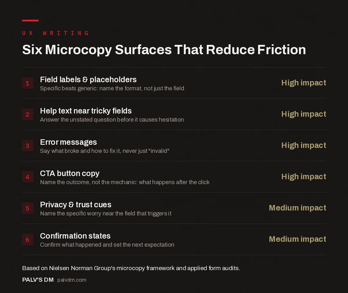
Six Microcopy Surfaces That Reduce Friction
- Field labels & placeholders: high impact. Specific beats generic: name the format, not just the field.
- Help text near tricky fields: high impact. Answer the unstated question before it causes hesitation.
- Error messages: high impact. Say what broke and how to fix it, never just “invalid”.
- CTA button copy: high impact. Name the outcome, not the mechanic: what happens after the click.
- Privacy & trust cues: medium impact. Name the specific worry near the field that triggers it.
- Confirmation states: medium impact. Confirm what happened and set the next expectation.
Field labels and error messages do the most damage when they’re wrong, because both appear at the exact point someone is trying, in real time, to complete an action. A vague label (“Name”) forces a guess. A cold error (“Invalid input”) gives no path forward. Both cost you the same visitor: one who was already committed enough to start filling in the form.
What does removing friction actually look like?
One documented example, published by a UX team redesigning sign-up for a free kids’ streaming platform: users kept assuming the free service required payment and dropping off before signing up. The team added five words under the sign-up button: “No credit card required.” Sign-ups rose 19%, with nothing else changed on the page. No redesign, no new marketing spend, one line addressing one specific unstated fear.
That’s the mechanic worth copying, not necessarily the number. Every form has an unstated objection sitting in a visitor’s head that the page never answers: will I get spammed, can I cancel, is this actually free, how long will this take. Find that objection and answer it in the microcopy nearest the action, and you remove friction that no amount of headline polish touches.
What separates clear microcopy from clever microcopy?
Clarity wins every time clarity and cleverness conflict. “Synergize your workflow” on a button sounds like nothing a real person would say out loud, and if a visitor has to pause to decode what a button does, you’ve already lost some fraction of them to hesitation. Compare “Submit” against “Send My Application,” or “Next” against “Continue to Payment.” The second version in each pair tells you what happens after the click. The first just tells you a click is expected.
Personality has a place, but it belongs on confirmation pages, empty states and 404s, the moments where someone isn’t mid-decision and isn’t frustrated. An error message mid-checkout is not the place to be cute. Someone whose card just got declined does not want charm. They want to know exactly what to fix.
How should error messages actually be written?
- Say what went wrong, specifically. “This field is required” beats a generic red asterisk with no explanation. “Your password needs at least one number and one capital letter” beats “Password does not meet requirements.”
- Never blame the user. “Invalid email” reads like an accusation. “That email doesn’t look quite right, check for a typo?” reads like a nudge from someone helping you, not judging you.
- Put the fix next to the problem. An error message at the top of a long form, disconnected from the field that triggered it, makes someone hunt for what actually broke. Inline, next to the specific field, every time.
- Keep the tone consistent with the rest of the product. A playful brand voice everywhere else and a cold, legalistic error message stands out as a jarring shift exactly when someone’s already frustrated.
What about privacy and trust cues near a form?
A one-line reassurance near the fields most likely to trigger hesitation earns its space. “We don’t share your number with anyone” next to a phone field, “Cancel anytime, no questions asked” next to a trial sign-up, “Used only to send your quote” next to an email field. These lines don’t inform in the technical sense the field label already does. They address the specific worry a visitor is silently running through before they commit.
Skip the vague version of this. “Your privacy matters to us” says nothing and answers nothing; it’s the kind of line visitors have learned to scroll past because every site has one and none of them commit to anything specific. Name the actual concern (spam, resale, surprise calls) and deny it directly, or don’t bother including the line at all.
Do confirmation states matter as much as the form itself?
More than people assume. A confirmation screen or thank-you message is the one microcopy moment where the user has already converted, so the temptation is to treat it as an afterthought: “Thanks, we got it.” That wastes a moment where someone is paying full attention and feeling good about a decision they just made.
A better confirmation does three things: confirms specifically what happened (“Your audit request is in, expect a reply within two working days” beats “Submitted”), sets the next expectation so they’re not left wondering, and, where it fits the brand, closes on a human note rather than a system log entry. None of this requires new design work. It’s the same box, different words.
How do you actually test whether it’s working?
Watch real people attempt the flow before you assume you know where they’ll stumble. Session recordings and simple user testing surface hesitation you’d never predict from a design review: someone rereading a field label three times, someone abandoning a form on the one field with no example text. If you’re not already reviewing heatmaps and session recordings, that’s a bigger gap than any individual line of copy.
Once you’ve got a hypothesis, A/B test it if you have the traffic to reach a real result, and don’t trust a “win” from a few hundred sessions. If you don’t have that traffic, change one line, watch the next batch of sessions, and use qualitative signal (fewer rage clicks, fewer abandoned fields) instead of chasing a statistically clean number you can’t actually reach.
Frequently asked questions
What is microcopy in UX design?
Microcopy is the small pieces of text guiding someone through an interface: button labels, field hints, error messages, confirmation text, and the one-line reassurances near a form. It’s not the headline or body copy. It’s the words at the exact moment someone has to decide whether to act.
Does microcopy actually move conversion numbers?
Documented cases exist, though results vary by context and shouldn’t be assumed to transfer directly to your site. One published case involved a free platform adding “No credit card required” below a sign-up button and seeing sign-ups rise by 19% with no other change. The mechanism, removing a specific unstated fear, is repeatable even if the exact number isn’t.
Where should I focus first if I only have time for a few fixes?
Error messages and form field labels first. They’re the two places where confusion causes an immediate, visible drop-off (someone abandons a form mid-fill), and they’re usually the fastest to rewrite since you don’t need new design work, just new words in the same UI elements.
Should microcopy be funny or serious?
Match your audience and the moment, not a default preference for personality. A playful tone works on a confirmation page or empty state. The same tone on an error message someone hits mid-checkout usually reads as tone-deaf, since they’re frustrated, not amused.
How do I know if my microcopy needs fixing?
Watch a handful of real users attempt the flow, or read session recordings if you have them. Hesitation before a field, a rage click on a disabled button, or repeated failed form submissions on the same field are the tells. If nobody’s watched a real session, that’s the first gap to close, not the copy itself.
Sources
- How to Boost Conversions with UX-Focused Microcopy, freeCodeCamp
- The 3 I’s of Microcopy: Inform, Influence, and Interact, Nielsen Norman Group
- Landing Page Structure That Converts Cold Traffic
- Writing CTAs People Actually Click
- Form Length vs Lead Quality: Finding the Balance
- Lead Qualification Before the Call: Forms That Filter
Want this done on your site?
Every PalV’s DM engagement starts with a free audit of your actual website — a 12-point
crawl covering what is blocking indexation, on-page gaps against your primary keywords, speed
findings, and the three to five fixes worth making first. Delivered in two working days. No
payment details, and the findings are yours whether you hire us or not.
Get your free SEO audit
See Web Development plans and prices