Heatmaps and Session Recordings: Reading Them Correctly
Heatmaps show where users click and scroll. Session recordings show why. Here is how to read both without drawing the wrong conclusion.

Read heatmaps first to spot where behaviour breaks down, then read session recordings second to understand why it broke down there. Doing it in the other order, or doing only one, is how most CRO conclusions end up wrong. A heatmap tells you visitors aren’t clicking your pricing CTA. It cannot tell you if that’s because they didn’t see it, didn’t trust it, or were still reading the paragraph above it.
This gets misread constantly because both tools produce visuals that look conclusive on their own. A bright red hot zone looks like an answer. It’s actually half of one. The other half is sitting in the recordings nobody watched.
What does a heatmap actually show you?
A heatmap aggregates every visitor’s clicks, taps or scroll position on a single page into one overlay. Most tools break this into three types. Click maps (sometimes called confetti or touch maps) show exactly where people clicked or tapped. Scroll maps show how far down the page visitors actually get before leaving, usually rendered as a fading gradient. Move maps track cursor movement on desktop, which correlates loosely with where people are reading, though it’s the least reliable of the three since a moving mouse doesn’t always mean attention.
Here’s the part that trips people up: a heatmap shows correlation between position and interaction, not cause. A red zone over a button means clicks happened there. It says nothing about whether those clicks led anywhere useful, whether the same visitor clicked five times out of frustration, or whether the element next to it was actually what they wanted.
What does a session recording add that a heatmap can’t?
A recording plays back one real visitor’s session: mouse movement, scrolling speed, clicks, form fields they filled and abandoned, rage clicks, dead clicks on things that looked clickable but weren’t. This is where the “why” behind a heatmap pattern usually surfaces.
The specific pattern to watch for is rage clicking, several rapid clicks on the same spot in a short window. On a heatmap this shows up as a normal, even a strong, hot zone. In a recording it’s obviously a frustrated visitor hammering something that isn’t responding. Same underlying data, completely opposite meaning, and you only catch the difference by watching the replay.
I’ve lost count of how many “high engagement” hot zones turned out to be a broken accordion or a form field that wasn’t actually clickable. Nobody flags it because the heatmap looked encouraging until someone finally sat down and watched ten of the sessions behind it.
How do you avoid drawing the wrong conclusion?
Run the two tools together, in sequence, with a specific question guiding each step.
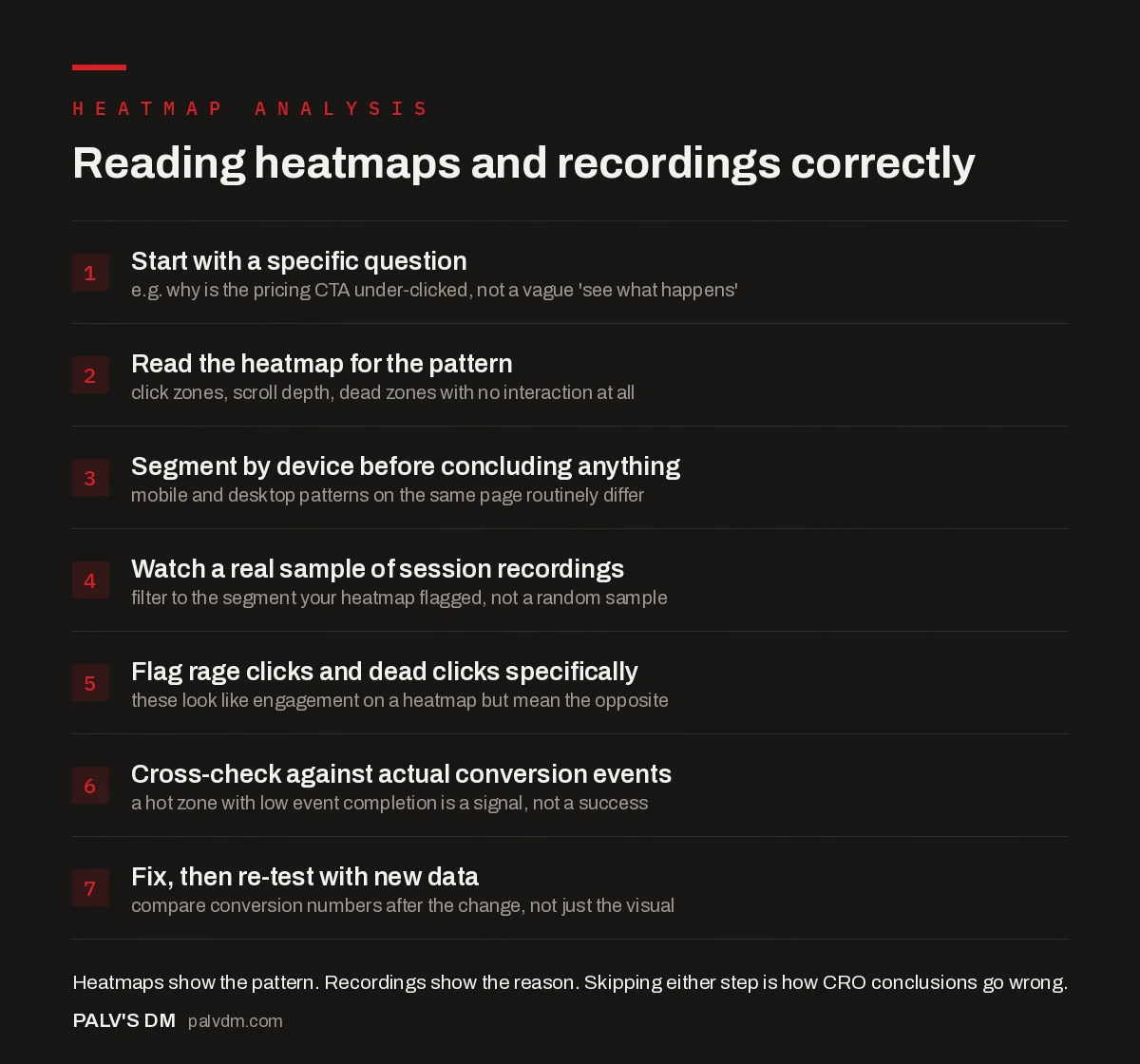
Reading heatmaps and recordings correctly
- Start with a specific question. e.g. why is the pricing CTA under-clicked, not a vague ‘see what happens’.
- Read the heatmap for the pattern. click zones, scroll depth, dead zones with no interaction at all.
- Segment by device before concluding anything. mobile and desktop patterns on the same page routinely differ.
- Watch a real sample of session recordings. filter to the segment your heatmap flagged, not a random sample.
- Flag rage clicks and dead clicks specifically. these look like engagement on a heatmap but mean the opposite.
- Cross-check against actual conversion events. a hot zone with low event completion is a signal, not a success.
- Fix, then re-test with new data. compare conversion numbers after the change, not just the visual.
Notice that watching recordings is step four, not step one. Opening a pile of session recordings with no hypothesis wastes an afternoon and usually just confirms whatever bias you walked in with. The heatmap earns you the right to watch with purpose.
What happens when the heatmap and the recordings disagree?
This happens more often than the marketing copy for these tools suggests, and it’s actually the most useful moment in the whole exercise. A common version: the heatmap shows a strong hot zone on your CTA button, which looks like success. The recordings behind it show visitors clicking it, landing on the next step, then bouncing within a few seconds.
Read separately, each data source tells a comfortable, incomplete story. The heatmap says the CTA works. Read together, the real story is that the CTA gets attention but whatever comes after it fails to deliver on what the click promised. That’s a completely different fix: the problem isn’t the button, it’s the page one click deeper.
Treat any conflict between the two as a signal to keep digging, not as a data quality problem. The disagreement is usually where the actual insight is hiding.
Hotjar (now Contentsquare) vs Microsoft Clarity: which one to reach for
Hotjar merged fully into Contentsquare’s corporate entity on 1 July 2025. Existing Hotjar accounts continue to work under the Hotjar product name inside the Contentsquare ecosystem, with billing gradually shifting over. Functionally, day-to-day heatmap and recording features work the same as before for most users during the transition.
Microsoft Clarity remains free, with no cap on traffic or sessions, and includes heatmaps, session recordings, rage-click and dead-click flagging, and AI-generated summaries of behaviour trends. For a small business site or an agency running this on a client’s behalf, Clarity is the sensible starting point precisely because there’s no budget conversation attached to trying it.
Where Hotjar (via Contentsquare) still pulls ahead is in bundled extras: surveys, feedback widgets and move maps as a genuine mouse-tracking layer separate from click data, useful specifically on long, content-heavy pages where you want to know what people are reading versus skimming past. If you already need those extras for a broader research programme, it’s worth the paid tier. If you just need to see where a landing page is leaking conversions, Clarity does that job without a pricing page in the way.
Which pages are actually worth analysing this way?
Not every page deserves this treatment, and running heatmaps everywhere at once just spreads your attention too thin to notice anything. Start with pages that carry the most weight in your funnel: the highest-traffic landing page, the pricing or service page right before a conversion event, and any page where Google Analytics shows a conversion rate that’s dropped without an obvious reason.
Blog posts and informational content are usually a waste of heatmap effort unless you’re specifically diagnosing whether internal CTAs within the content get seen at all. Scroll depth on a 2,000-word article tells you something about content length tolerance, but it rarely changes a business decision the way a checkout page heatmap does.
One thing worth flagging from direct experience: heatmaps on pages with a sticky header or a cookie consent banner routinely misattribute clicks to whatever sits underneath that overlay, because the tool can’t always tell the difference between a click on the fixed element and a click on the content behind it. If a hot zone looks suspiciously aligned with where your cookie banner sits, that’s worth double-checking before you act on it.
What should you actually do with what you find?
- Prioritise fixes by funnel position, not by how visually dramatic the heatmap looks. A confusing element on your highest-traffic entry page matters more than one on a page three clicks deep.
- Segment by device before you conclude anything. Mobile and desktop behaviour on the same page routinely tell two different stories, especially around sticky headers and thumb-reach zones on smaller screens.
- Cross-check against Google Analytics events, not just visuals. A hot zone with a low actual conversion event attached is a red flag worth a closer look, not a page you leave alone.
- Re-test after any fix. Heatmap tools make it tempting to eyeball a “before and after” and call it done. Pair the visual comparison with actual conversion numbers before declaring victory.
Frequently asked questions
What’s the difference between a heatmap and a session recording?
A heatmap aggregates clicks, taps and scroll depth across every visitor on a page into one visual overlay. A session recording plays back one specific visitor’s actual mouse movement, scrolling and clicks as an individual video. Heatmaps show patterns at scale. Recordings show one person’s real behaviour.
How many sessions do I need before a heatmap is reliable?
There’s no universal number, and any tool that gives you one exact threshold is oversimplifying. Low-traffic pages need proportionally more time collecting data before a pattern is trustworthy rather than noise. Treat early heatmaps on new or low-traffic pages as directional, not conclusive.
Are Hotjar and Microsoft Clarity accurate?
Both track real user interaction events reliably at the browser level. Where accuracy questions come in is interpretation, not data capture: a hot click zone can mean strong interest or strong confusion, and the tool cannot tell you which without you watching the recordings behind it.
Do heatmap tools slow down my website?
The tracking script itself is small and loads asynchronously, so the direct performance hit is minor on a properly implemented site. The bigger risk is stacking several analytics and tracking scripts together without auditing total third-party script weight.
Are heatmaps GDPR compliant?
Both major tools offer settings to mask form inputs and sensitive text by default, which helps compliance, but the tool’s settings alone don’t make you compliant. You still need a valid legal basis and, in most cases, cookie consent before the tracking script fires.
Should I read heatmaps or session recordings first?
Heatmaps first, to spot the pattern. Session recordings second, to understand the pattern’s cause. Starting with recordings without a specific question in mind usually means watching random sessions and confirming whatever you already believed.
Sources
- Microsoft Clarity — Free Heatmaps & Session Recordings
- Hotjar Is Merging Into Contentsquare — Billing and Legal Changes
- Core Web Vitals: LCP, INP and CLS Explained Properly
- A/B Testing With Low Traffic: Statistical Honesty
- Mobile Conversion: What Breaks on a 5-Inch Screen
- Conversion Rate Optimisation for Small Traffic Sites
Want this done on your site?
Every PalV’s DM engagement starts with a free audit of your actual website — a 12-point
crawl covering what is blocking indexation, on-page gaps against your primary keywords, speed
findings, and the three to five fixes worth making first. Delivered in two working days. No
payment details, and the findings are yours whether you hire us or not.
Get your free SEO audit
See Web Development plans and prices