Thank-You Pages That Do More Than Say Thanks
How to turn a thank-you page into a working part of your funnel: what to include, what to test, and the tracking setup most sites get wrong.
A thank-you page should confirm what just happened, tell the visitor what comes next, and give them exactly one relevant next step, not a generic “thanks, we’ll be in touch” and nothing else. Most sites treat this page as an afterthought. It’s the one page on the entire site where you have a visitor’s full attention immediately after they’ve said yes to something.
That’s the part that gets missed. Every other page on your site is competing for attention against a hundred other tabs and a wandering mind. The thank-you page loads right after someone actively chose to act. Wasting that moment on a bare “Thanks!” with no direction is leaving something on the table for free.
Why does this page matter more than it looks like it should?
Because it’s the only page in your funnel guaranteed to load in front of someone who just converted. Every other page has to earn attention. This one already has it. Whether that attention gets used to build trust, capture a second conversion, or simply reduce the anxiety of “did that actually work” is entirely up to what you put on the page.
It’s also a genuine, low-effort test bed. Because traffic to a thank-you page is a filtered, high-intent segment, you can test variations here with far fewer visitors than you’d need to reach significance on a cold landing page, and the findings often transfer usefully to earlier funnel stages.
What actually belongs on a thank-you page?
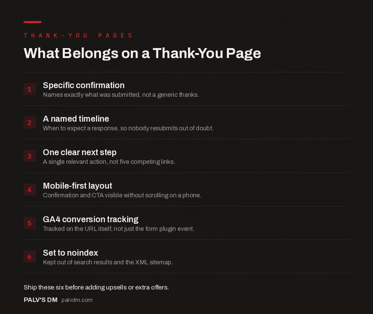
The checklist below is ordered by priority, not by how impressive each element sounds.
What Belongs on a Thank-You Page
- Specific confirmation. Names exactly what was submitted, not a generic thanks.
- A named timeline. When to expect a response, so nobody resubmits out of doubt.
- One clear next step. A single relevant action, not five competing links.
- Mobile-first layout. Confirmation and CTA visible without scrolling on a phone.
- GA4 conversion tracking. Tracked on the URL itself, not just the form plugin event.
- Set to noindex. Kept out of search results and the XML sitemap.
How does this differ for a form submission vs. a purchase?
A lead-gen form and an ecommerce checkout confirm different anxieties, so the page needs to answer different questions. After a purchase, the visitor wants to know their money went through and when the product arrives, so order details and shipping information come first. After a form submission (a quote request, a consultation booking, a content download), the visitor wants to know their request was actually received and what happens next: a callback within a set window, an email with a resource, a calendar link to book a slot directly.
The mistake we see most often on service-business sites is copying an ecommerce thank-you template onto a lead-gen form. It ends up all confirmation and no direction, no next step named, no timeline given, which quietly increases the number of people who assume the form failed and submit it again or give up and call a competitor instead.
Is the upsell-on-thank-you-page approach actually worth it?
Post-purchase and post-conversion offers on this page can genuinely add incremental revenue, and it’s a well-documented tactic among ecommerce brands specifically. The condition that makes it work: the offer has to be secondary to the confirmation, not competing with it. A visitor scanning the page first needs to see “your order is confirmed” or “we received your request,” clearly, before anything else asks for a second commitment.
Where this goes wrong is when the upsell is generic rather than relevant to what was just purchased or requested. A discount code for a product category the visitor has shown zero interest in reads as noise, not value. Match the follow-up offer to the action just taken, or skip it and use the space for something the visitor will actually use: a resource, a next-step link, a way to reach a human.
What should the copy actually say?
- Confirm specifically, not generically. “We received your request for a web development quote” beats “Thank you for your submission” because it removes any doubt about whether the right form fired.
- Name a timeline. “We’ll respond within one business day” sets an expectation that reduces follow-up anxiety and stops people from resubmitting the form or emailing separately to check.
- Offer one clear next action, not five. A page with six competing links (social media, newsletter signup, three blog posts, a discount code) diffuses attention instead of directing it. Pick the single most valuable next step for this specific visitor and lead with that.
- Skip the stock photo of people high-fiving. It doesn’t build trust and it doesn’t answer any question the visitor actually has in that moment.
How should you track and test this page?
Set the thank-you page as a defined conversion event in GA4, filtered on the URL path, rather than relying solely on a form plugin’s own submission event. Form plugins sometimes fire a “success” event even when a downstream step like a CRM sync or an email notification fails, which means your reported conversion count and your actual lead count can quietly drift apart. Landing on the actual confirmation URL is a more reliable signal that the process genuinely completed. For the full setup, see our guide on using WhatsApp as a conversion channel, which covers a similar confirmation-tracking problem specific to chat-based lead capture.
Once tracking is solid, this page is one of the easiest places on a site to run a genuine A/B test. Traffic here is small but qualified, so even a modest sample size can surface a meaningful difference between, say, a single CTA versus two competing ones.
Should a thank-you page be indexed by Google?
Generally, no. A thank-you page has no unique value to a cold search visitor and, if indexed, it can occasionally rank for branded or transactional queries in a way that undercuts the actual page you want people to land on. Set it to noindex, and while you’re there, make sure it’s excluded from your XML sitemap. This is a small technical detail that’s easy to forget and rarely gets caught until someone notices a confirmation page showing up in Search Console’s performance report.
What about mobile visitors specifically?
A large share of form submissions on Indian service-business sites now happen on mobile, often straight after a WhatsApp conversation or a click from a Google Business Profile listing. On a small screen, a thank-you page crowded with multiple offers and long paragraphs gets skimmed past entirely. Keep the confirmation line and the single next action visible without scrolling. If there’s a phone number or WhatsApp link as the next step, make it a tappable button, not plain text a thumb has to select and copy.
Test the page on an actual mid-range phone, not just a browser window resized on a desktop monitor. Rendering issues that never show up in desktop testing, like a CTA button pushed below the fold by an oversized confirmation icon, are common enough that we check this on every audit as a matter of routine.
What’s a realistic first step if you’ve never touched this page?
Don’t try to rebuild every thank-you page on the site in one pass. Start with the highest-value form: the main quote request or contact form, usually. Confirm the copy is specific, add one clear timeline sentence, and set up proper GA4 tracking on that single page first. Once that’s live and you’ve watched it for a few weeks, extend the same pattern to the rest. Trying to redesign every confirmation page across the site simultaneously is how this kind of project stalls out and never ships.
Frequently asked questions
What should every thank-you page include at minimum?
Confirmation of what just happened, a clear next step (what to expect and when), and one relevant path forward, whether that’s related content, a second lower-commitment offer, or a way to reach you directly. Anything beyond that is a bonus, not a requirement.
Should I put an upsell on a thank-you page?
It can work, but only if the offer is genuinely relevant to what the visitor just did and doesn’t overshadow the confirmation itself. A visitor who just submitted a quote request wants to know their request was received before they see anything else; lead with that.
How do I track thank-you page visits properly in GA4?
Set the thank-you page URL as a GA4 conversion event, either through a page_view event filtered by page path or a dedicated event fired on load. Avoid relying on the form submission event alone, since form plugins can fire it even when a submission technically fails downstream.
Can a thank-you page hurt SEO?
It can, if it’s accidentally indexed and starts competing with or diluting your real content. Thank-you pages generally shouldn’t be indexed, since they have no value to a search visitor arriving cold and no unique content worth ranking.
Should thank-you pages be different for every form on my site?
Ideally yes, or at least segmented by intent. A visitor who requested a quote and one who downloaded a free checklist are at different points in the funnel, and a generic one-size page wastes the chance to route each one to the next right step.
Sources
- Thank you page examples and best practices, Unbounce
- GA4 events reference, Google Analytics developer docs
- Landing Page Structure That Converts Cold Traffic
- Form Length vs Lead Quality: Finding the Balance
- Lead Qualification Before the Call: Forms That Filter
- WhatsApp as a Conversion Channel for Indian Businesses
Want this done on your site?
Every PalV’s DM engagement starts with a free audit of your actual website — a 12-point
crawl covering what is blocking indexation, on-page gaps against your primary keywords, speed
findings, and the three to five fixes worth making first. Delivered in two working days. No
payment details, and the findings are yours whether you hire us or not.
Get your free SEO audit
See Web Development plans and prices