
Image Dimensions and CLS: The Two-Attribute Fix
Missing width and height attributes on img tags are one of the most common causes of Cumulative Layout Shift. Add both attributes and the browser reserves the right space before the image loads.

The fix for image-caused Cumulative Layout Shift is two HTML attributes: width and height on every <img> tag, set to the image’s real pixel dimensions. With both present, the browser calculates the aspect ratio before a single byte of the image file downloads and reserves that exact box in the page layout, so nothing else on the page has to jump when the image finally arrives.
This is consistently one of the fastest Core Web Vitals wins available on an existing site. No redesign, no new plugin, no server change — just two attributes that are frequently missing because a theme, a page builder, or a hand-written template never set them.
Why does a missing width or height attribute cause layout shift?
A browser starts rendering a page before every asset has finished loading. Text, background colours, and CSS-defined boxes render fast; images take longer because the file itself has to download. If the browser doesn’t know how tall an image is going to be, it initially renders that spot in the layout as zero height — collapsed to nothing. The moment the image file arrives and the browser reads its real dimensions, that spot snaps open to the image’s actual height, and everything below it — text, buttons, other images — gets pushed down.
That pushed-down jump is exactly what Cumulative Layout Shift (CLS) measures. Google’s Core Web Vitals research on web.dev is explicit about the mechanism: browsers can only reserve the correct aspect ratio in advance when the width and height are declared before the file loads, whether through HTML attributes or an equivalent CSS rule. Without that declaration, there is no way for the browser to know the box size ahead of time.
Step 1: Confirm the problem with a CLS diagnostic
Before touching templates, verify that images are actually the CLS source on the pages in question. Run PageSpeed Insights or open Chrome DevTools’ Performance panel and record a page load — both tools list the specific DOM elements responsible for each layout shift event. If the “Layout Shift Culprits” or equivalent list is dominated by <img> elements, this fix directly targets the score. If the culprits are ads, web fonts, or injected banners instead, this fix alone won’t move the number, and those causes need separate treatment.
Step 2: Add explicit width and height to every image tag
For static, template-rendered images — logos, icons, hero banners, content images inserted through a CMS editor — set width and height to the image’s real pixel dimensions:
<img src="product-photo.jpg" width="800" height="600" alt="Product photo">These are the image’s intrinsic dimensions, not the size it will display at on any particular screen. A photo that’s 800 by 600 pixels natively gets those exact attribute values even if CSS later scales it down to fit a 400px-wide column. The browser uses the 800:600 ratio to reserve proportional space at whatever width the layout ultimately renders.
Step 3: Pair the attributes with responsive CSS
The two HTML attributes handle space reservation; CSS handles actual rendered size on different screens. Without a supporting CSS rule, a fixed 800×600 attribute pair can make an image ignore a narrower container. The standard pairing is:
img { max-width: 100%; height: auto; }This lets the browser use the HTML attributes to compute and reserve the correct aspect ratio at load time, then scale the image fluidly within its container afterward. Most modern CSS resets already include this rule; it’s worth confirming rather than assuming.
Step 4: Handle dynamic and user-uploaded images
Product images, avatars, and other content added by users or pulled from an external feed don’t have dimensions known at template-build time. The fix is to read the file’s actual pixel dimensions once, at upload or ingestion, and store them next to the image URL in the database — then render the width and height attributes from that stored data every time the template outputs the tag. WordPress’s native media library already does this for anything uploaded through the standard uploader; the gap usually shows up in custom fields, ACF image fields rendered without the attribute helper, or images pulled from a third-party API that only returns a URL.
Step 5: Cover lazy-loaded and above-the-fold images differently
Lazy loading and CLS interact in a way that makes this fix more urgent, not less. An image with loading="lazy" and no dimensions leaves a collapsed, zero-height gap that snaps open the instant it scrolls into view and starts loading — which means the shift happens exactly when the user is reading that section, the worst possible timing for a layout jump. Dimensions on lazy images aren’t optional; they’re the whole point.
For the single largest image above the fold — usually the one driving Largest Contentful Paint — skip lazy loading entirely and set fetchpriority="high" alongside the width and height attributes, so the browser prioritises that download instead of treating it as low-priority background content.
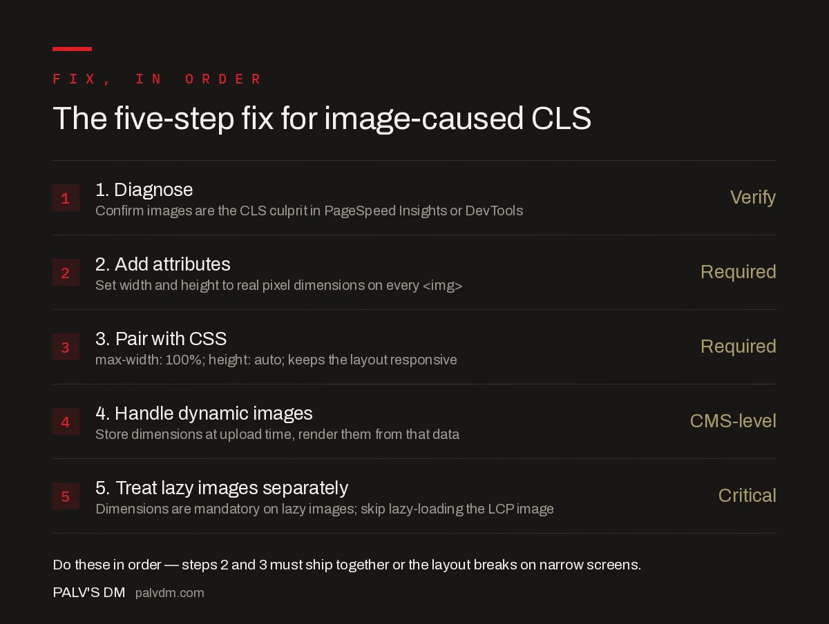
The five-step fix, in order
| Step | What to do |
|---|---|
| 1. Diagnose | Confirm images are the CLS culprit in PageSpeed Insights or DevTools |
| 2. Add attributes | Set width and height to real pixel dimensions on every <img> |
| 3. Pair with CSS | max-width: 100%; height: auto; so layout stays responsive |
| 4. Handle dynamic images | Store dimensions at upload time, render them from that data |
| 5. Treat lazy images separately | Dimensions are mandatory on lazy images; skip lazy-loading the LCP image |
What common mistakes undo this fix?
- Using display size instead of intrinsic size. Setting
width="400" height="300"on a file that’s actually 1600×1200 gives the browser the wrong aspect ratio to reserve, which can itself cause a smaller, secondary shift when the real ratio takes over. - Forgetting background images. CSS
background-imagedeclarations don’t support width/height attributes at all — those need a fixed-ratio container (viaaspect-ratioor padding-based techniques) instead. - Applying the fix in the theme but not in user-generated content areas. A blog post body edited in a rich text editor often bypasses the template’s image helper entirely, leaving raw
<img>tags with no attributes. - Setting width and height via inline style instead of attributes on old browsers. Attributes are the more broadly supported mechanism; treat CSS
aspect-ratioas a supplement, not a replacement, unless legacy browser support isn’t a concern. - Ignoring responsive art direction. Sites serving different crops per breakpoint via
<picture>andsrcsetstill need width/height on the fallback<img>, matching that fallback image’s own dimensions.
How much CLS improvement does this actually produce?
The size of the improvement depends on how many images on a page were previously undeclared and how prominent they are in the layout — a single small icon missing dimensions barely registers, while a content-width image inserted mid-article without dimensions can be responsible for the entire page’s CLS score on its own. The reliable way to see the actual number for a specific site is a before/after PageSpeed Insights or Chrome UX Report comparison, not a generic industry figure, since layout, image count, and placement vary too much between sites for one number to apply everywhere.
Does this fix also help Largest Contentful Paint?
Indirectly. Declaring width and height doesn’t make an image file download faster, so it isn’t a direct LCP fix. But a stable layout means the browser isn’t recalculating and repainting content around a shifting image box, which removes one source of rendering overhead during page load. For the LCP-specific work — format, compression, preloading, priority hints — how to fix a poor LCP score, step by step covers the full sequence.
Frequently asked questions
Do I need both width and height, or does one attribute work?
Both. Modern browsers use the width and height attributes together to calculate the image’s aspect ratio and reserve that exact box in the layout before the file downloads. One attribute alone gives the browser only half the equation, and it falls back to reserving no space at all.
Do width and height attributes make images render at the wrong size on responsive layouts?
No, as long as CSS also has width: 100%; height: auto; (or similar) on the image. The HTML attributes only tell the browser the intrinsic aspect ratio for space reservation; CSS still controls the rendered size. Without that CSS, a fixed-width image can overflow a narrow container.
What if I don’t know an image’s exact dimensions, like user-uploaded content?
Read the file’s actual pixel dimensions at upload time and store them alongside the URL, then render the width and height attributes from that stored data. Most CMS media libraries, including WordPress, already do this automatically for images added through the media uploader.
Does lazy loading make the width and height attributes less necessary?
No, it makes them more necessary. A lazily loaded image without dimensions leaves a zero-height gap that snaps open the moment the image enters the viewport and loads, causing a layout shift at exactly the point the user is reading that part of the page.
Can CSS aspect-ratio replace the HTML width and height attributes?
It can achieve the same space-reservation effect, but it requires a CSS rule to be written and maintained for every relevant image selector. The HTML attributes work automatically wherever the image tag is generated, which is why they remain the simpler default for most sites.
Sources
- Optimize Cumulative Layout Shift — web.dev
- Core Web Vitals: The Complete Guide
- Technical SEO: The Complete Working Guide
- Why Your Mobile Score Is Far Worse Than Desktop
- How to Fix a Poor LCP Score, Step by Step
- Web Font Loading Strategies That Don’t Cause Layout Shift
Want this done on your site?
Every PalV’s DM engagement starts with a free audit of your actual website — a 12-point
crawl covering what is blocking indexation, on-page gaps against your primary keywords, speed
findings, and the three to five fixes worth making first. Delivered in two working days. No
payment details, and the findings are yours whether you hire us or not.