
Mobile Usability Issues: The Search Console Report Is Gone, Here’s What to Use
Google retired the Mobile Usability report in Search Console in 2023. Here's how to actually find and fix mobile usability issues now.
The Mobile Usability report in Search Console doesn’t exist anymore. Google retired it on December 4, 2023, along with the Mobile-Friendly Test tool. If you’re searching for it because a client asked about “mobile usability errors” or an old audit template mentions it, you’re not missing a setting. It’s genuinely gone, and most of the articles still walking through “how to fix errors in the Mobile Usability report” are describing a tool that hasn’t existed for over two years.
That doesn’t mean mobile usability stopped mattering. It means the way you check for it changed, and a surprising number of agencies and site owners haven’t caught up. Here’s what to use instead, and what the old report used to catch that you should still be checking for.
Why did Google retire the Mobile Usability report?
Google’s own explanation, posted when the retirement went live, was straightforward: in the nearly ten years since the report launched in 2014, mobile-friendliness went from a differentiator to a baseline expectation, and better tools had emerged to evaluate it. Specifically, Google pointed to Lighthouse, the auditing engine built into Chrome DevTools, as covering the same ground with more depth. The Mobile-Friendly Test tool now redirects straight to Lighthouse if you try to visit its old URL.
The retirement covered three things at once: the Search Console report itself, the standalone Mobile-Friendly Test tool, and the Mobile-Friendly Test API that some agencies had built bulk-checking scripts around. All three stopped working the same week.
Does losing the report mean mobile usability stopped mattering for SEO?
No, and this is worth being direct about. Google has used mobile-first indexing for virtually every site since 2019, which means the mobile rendering of your page, not the desktop version, is what gets crawled, indexed and evaluated. A page with tap targets crammed together or text too small to read without pinching is still a worse experience for the majority of your visitors, since mobile traffic is the majority on most business sites now. Losing the report changed the tooling. It didn’t change the incentive to get this right.
What do you actually use to check mobile usability today?
Three tools cover most of what the old report used to do, each suited to a different situation.
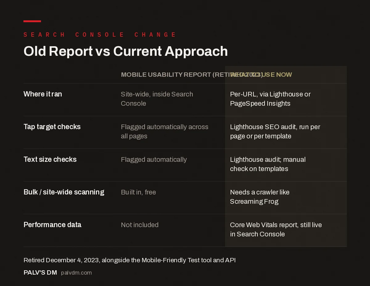
Old Report vs Current Approach
| Mobile Usability report (retired 2023) | What to use now | |
|---|---|---|
| Where it ran | Site-wide, inside Search Console | Per-URL, via Lighthouse or PageSpeed Insights |
| Tap target checks | Flagged automatically across all pages | Lighthouse SEO audit, run per page or per template |
| Text size checks | Flagged automatically | Lighthouse audit; manual check on templates |
| Bulk / site-wide scanning | Built in, free | Needs a crawler like Screaming Frog |
| Performance data | Not included | Core Web Vitals report, still live in Search Console |
For a single page, Lighthouse in Chrome DevTools (right-click, Inspect, then the Lighthouse tab) gives you the most detail, including specific elements flagged as too small or too close together, with line-level references. PageSpeed Insights runs the same Lighthouse engine against a live URL without needing DevTools open, which is faster for a quick spot check and doubles as your Core Web Vitals check in the same pass. For checking many pages at once, which is really what the old Search Console report was good for, a crawler like Screaming Frog with its mobile rendering options enabled will flag viewport and content-width issues site-wide, though it won’t replicate every check the retired report ran.
How do you actually run a mobile usability check today?
Five minutes, no account or software installation required beyond Chrome.
- Open the page in Chrome, right-click anywhere, and select Inspect. This opens DevTools.
- Click the Lighthouse tab. If it’s not visible, click the double-arrow overflow menu at the top of the DevTools panel.
- Set the device toggle to Mobile and select the categories you want. SEO and Performance cover most of what the old report checked; add Accessibility for a fuller picture.
- Run the audit and read the flagged items, not just the score. The number at the top is less useful than the specific list underneath it, which names exact elements and line references.
- Fix the template, not the page. If a tap target issue shows up on one blog post, it’s almost always coming from the theme’s post template, which means the same fix clears every post built from it.
For a URL you don’t want to open DevTools on, or for checking from a phone, pagespeed.web.dev runs the identical Lighthouse engine against any public URL and returns the same flagged issues in a browser tab.
Is the Core Web Vitals report in Search Console the same thing?
Not quite, and conflating the two causes confusion. Core Web Vitals measures loading performance, interactivity and visual stability (LCP, INP, and CLS), using real user data collected from Chrome. Mobile usability, in the old report’s sense, measured layout and interaction design: text size, tap target spacing, viewport configuration. A page can pass every Core Web Vitals threshold and still have tap targets crammed too close together, and vice versa. They’re related, both affect how usable a page feels on a phone, but they’re measuring different things, and the Core Web Vitals report won’t catch a text-too-small problem on its own.
What are the specific issues worth checking for?
These are the categories the old report used to flag. They’re still valid usability problems, they just need a different tool to surface them now.
- Text too small to read. Google’s old threshold was roughly 12 pixels for body text. Anything smaller forces pinch-to-zoom, which is friction most visitors won’t push through.
- Tap targets too small or too close together. Buttons and links under about 48 by 48 pixels, or spaced closer than about 8 pixels apart, cause mis-taps. This shows up constantly on nav menus and footer links ported over from a desktop-first design.
- Content wider than the viewport. Usually caused by a fixed-width element, an embedded video, or a table that wasn’t built to be responsive, forcing horizontal scroll.
- Missing or misconfigured viewport meta tag. Without
<meta name="viewport" content="width=device-width, initial-scale=1">, mobile browsers render the page at desktop width and shrink it, which breaks everything downstream. - Interstitials that cover the main content. A newsletter popup or cookie banner that can’t be dismissed without hunting for a tiny close button is exactly the kind of thing this used to flag, and it’s still a real usability failure even without a report naming it.
In practice, the viewport meta tag issue is the one I still see on older WordPress themes that never got updated for mobile-first indexing. It takes one line in the header template to fix and it’s usually the first thing worth checking on an inherited site, before anything else on this list.
How do you check mobile usability at scale without the old report?
This is the genuine gap. The retired report’s real value wasn’t the individual checks, all of which Lighthouse still runs, it was running them across every indexed page automatically and surfacing which URLs had problems without you having to test each one by hand. Nothing free from Google fills that exact gap today.
The practical workaround: run a Screaming Frog crawl with “Rendered Page” screenshots enabled for a visual spot-check across templates, since most mobile usability problems are template-level, not page-level, meaning fixing one blog post template fixes every post built from it. Separately, the Core Web Vitals report in Search Console still segments by device and shows mobile-specific field data for any URL group with enough traffic, which won’t catch every usability issue but will catch the performance-adjacent ones, like layout shift caused by a mistimed ad or font load.
Frequently asked questions
Why can’t I find the Mobile Usability report in Search Console anymore?
Google retired it on December 4, 2023, along with the Mobile-Friendly Test tool and its API. Google’s stated reason was that mobile-friendliness is now a baseline expectation across the web, and tools like Lighthouse cover the same checks more thoroughly.
Does this mean mobile usability doesn’t affect rankings anymore?
No. Google has indexed mobile-first since 2019 for effectively every site, meaning the mobile version of your page is what gets crawled and evaluated. Mobile usability still matters for both rankings and conversions; only the dedicated report went away, not the underlying signal.
What replaced the Mobile Usability report?
Lighthouse, built into Chrome DevTools and also what runs behind PageSpeed Insights, is Google’s recommended replacement. It checks tap target sizing, viewport configuration, and font legibility as part of its SEO and accessibility audits, run per-URL rather than site-wide.
How do I check mobile usability across many pages at once now?
There’s no free bulk tool from Google anymore. A site crawler like Screaming Frog can flag viewport and mobile-rendering issues at scale, and the Core Web Vitals report in Search Console still shows mobile-specific field data for pages with enough traffic, which catches performance-related usability problems even without the old report.
What are the tap target and font size minimums Google used to flag?
The old report flagged tappable elements smaller than roughly 48 by 48 pixels or spaced too closely together, and body text smaller than about 12 pixels. Those aren’t official ranking thresholds published anywhere today, but they remain reasonable, widely used defaults for genuinely usable mobile design.
Sources
- Google officially drops Mobile Usability report, Search Engine Land
- Lighthouse overview, Chrome Developers
- WordPress SEO: The Complete Configuration Guide
- Accessibility Basics That Also Help SEO
- Custom 404 Pages That Recover the Visit
- Cookie Banners Under DPDP: Doing It Without Wrecking UX
Want this done on your site?
Every PalV’s DM engagement starts with a free audit of your actual website — a 12-point
crawl covering what is blocking indexation, on-page gaps against your primary keywords, speed
findings, and the three to five fixes worth making first. Delivered in two working days. No
payment details, and the findings are yours whether you hire us or not.
Get your free SEO audit
See Web Development plans and prices