
Mobile-First Indexing: What Still Trips Sites Up
Google indexes the mobile version of nearly every site, yet mismatched content, missing schema, and hidden mobile interactions still cause real ranking losses. Here's what still breaks and how to check it.

Mobile-first indexing means Google uses the mobile version of your pages — crawled with the Googlebot Smartphone user agent — to decide what to index and how to rank you, and it’s applied to essentially every indexable site since 2020. The rollout is old news; the failures that still cost sites rankings are newer and subtler: content trimmed on mobile templates, structured data only present on desktop, images stripped for load speed, and interactions that hide primary content from a crawler that doesn’t click or swipe.
Most sites built in the last five years launched mobile-first or responsive by default, so the classic failure mode — a separate m.site with less content — is rarer than it was. The problems that remain are the ones nobody notices because both versions look fine to a human on each device. They only show up when you compare what Googlebot Smartphone actually receives against what a desktop visitor sees.
What does mobile-first indexing actually change?
Before 2018, Google primarily crawled and indexed the desktop version of a page, even though most searches by then came from mobile devices. Mobile-first indexing flipped that: Googlebot Smartphone became the primary crawler, and the content, links, and structured data it finds on the mobile render are what gets indexed and used for ranking, on both mobile and desktop search results.
Google’s own documentation on mobile-first indexing is direct about the requirement: the mobile version needs to contain the same important content as the desktop version. Not similar. Not a summary. The same primary content, the same structured data, the same meta directives.
What are the failure modes that still trip up sites?
These five account for most of the real mobile-first indexing problems found in audits today, roughly in order of how often they show up.
Content trimmed for mobile load speed
Developers under pressure to hit Core Web Vitals targets sometimes cut secondary content — related articles, extended specs, author bios — from the mobile template to reduce page weight. That content disappears from what Google indexes too, since Googlebot Smartphone never sees it.
Structured data present on desktop only
Schema markup added once, to a desktop-only template partial, doesn’t automatically carry to the mobile render if the two use different includes. Article, Product, and FAQ schema are common casualties — present in “view source” on desktop, absent on mobile.
Images dropped or served at lower resolution without matching alt text
Responsive image techniques that swap a smaller file for mobile are fine. Responsive techniques that drop the image entirely below a certain breakpoint mean product photos, diagrams, or infographics stop being indexed for mobile-first purposes.
Robots meta tags that differ between versions
A noindex tag applied only to the desktop version, perhaps by an old plugin rule that never got updated, does nothing under mobile-first indexing — Google reads the mobile version’s directive. The reverse is more dangerous: a noindex accidentally left on the mobile template deindexes the page entirely, even though the desktop version looks fully indexable.
Primary content behind an interaction Googlebot doesn’t perform
Accordion-collapsed content, tabs that require a click, or text that only renders after a swipe gesture on mobile templates can be invisible to a crawler that doesn’t interact with the page the way a person does.
Which mobile configuration should you actually use?
Google supports three configurations, but they aren’t equally safe under mobile-first indexing.
| Configuration | How it works | Mobile-first indexing risk |
|---|---|---|
| Responsive web design | Same HTML, same URL, CSS adapts the layout to screen size | Lowest — content parity is structurally guaranteed |
| Dynamic serving | Same URL, server detects device and returns different HTML | Medium — requires a Vary: User-Agent header and disciplined template parity |
| Separate mobile URLs (m.site) | Different URL for mobile, linked via rel=alternate/canonical pairs | Highest — every content or schema update has to be replicated across two codebases |
Google recommends responsive web design specifically because it removes the two most common mobile-first indexing failure modes — content parity and duplicate URL management — by construction rather than by ongoing diligence.
How do you audit a site for mobile-first indexing issues?
A focused audit checks the same six things across a representative sample of templates, not every URL on the site.
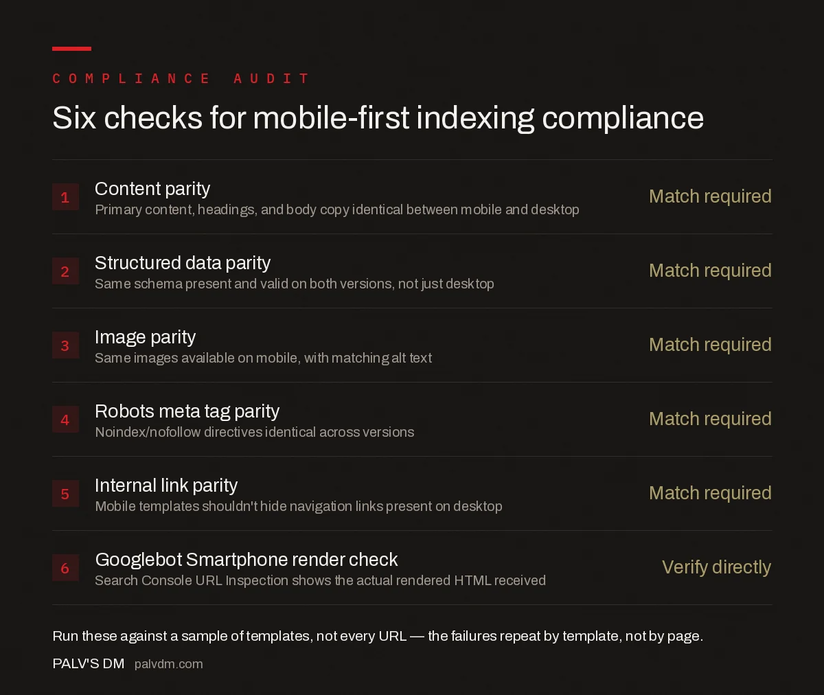
Six checks for mobile-first indexing compliance
- Content parity — Match required. Primary content, headings, and body copy identical between mobile and desktop renders.
- Structured data parity — Match required. Same schema present and valid on both versions, not just desktop.
- Image parity — Match required. Same images available on mobile, with matching alt text, not dropped for load speed.
- Robots meta tag parity — Match required. Noindex/nofollow directives must be identical across versions.
- Internal link parity — Match required. Mobile templates shouldn’t hide navigation links present on desktop.
- Googlebot Smartphone render check — Verify directly. Search Console’s URL Inspection tool shows the actual rendered HTML Googlebot received.
The URL Inspection tool’s “View Crawled Page” screenshot and HTML output are the ground truth here — everything else is inference. Run it on your highest-value templates first: product pages, core service pages, and anything carrying schema you rely on for rich results.
How does mobile-first indexing interact with lazy loading?
Lazy loading images and content on scroll is standard practice for performance, and Google explicitly supports it when implemented with the IntersectionObserver API or native loading="lazy" attributes, because Googlebot’s rendering process triggers standard scroll-based loading during its render pass. What breaks is lazy loading gated behind a user action Googlebot doesn’t simulate — a click to “load more,” a hover to reveal a tooltip, or a swipe through a carousel where only the first slide renders server-side. If a template needs that interaction to show primary content, that content is functionally invisible for indexing purposes.
Frequently asked questions
What is mobile-first indexing?
Mobile-first indexing means Google crawls, indexes, and ranks a site using the mobile version of its pages, fetched with the Googlebot Smartphone user agent, rather than the desktop version. Google moved every indexable site in the world to mobile-first indexing by 2020.
Does mobile-first indexing mean my desktop site is ignored?
Yes, for ranking purposes. Google still crawls desktop URLs occasionally and desktop users still see whatever version your site serves them, but the content, links, and structured data used to decide rankings come from what Googlebot Smartphone sees on mobile.
How do I check if my site is fully compliant with mobile-first indexing?
Compare the rendered mobile and desktop HTML for a sample of templates, checking that primary content, structured data, headings, and meta robots tags match. Search Console’s URL Inspection tool shows exactly what Googlebot Smartphone rendered for any given page.
Does responsive design automatically fix mobile-first indexing issues?
Responsive design removes most causes of mismatch because both versions share the same HTML and URL. It doesn’t automatically fix content hidden behind mobile-only interactions, images missing on the mobile viewport, or lazy-loading that never fires for Googlebot.
Can lazy loading hurt mobile-first indexing?
Yes, if content only loads after a user interaction Googlebot doesn’t perform, such as a click, swipe, or hover. Content that lazy-loads on scroll using the standard Intersection Observer pattern is generally fine; content gated behind a click handler is often invisible to Googlebot.
Sources
- Mobile-first Indexing Best Practices — Google Search Central
- Technical SEO: The Complete Working Guide
- Faceted Navigation: Controlling the Crawl Explosion
- hreflang Implementation Without the Common Errors
- Pagination and SEO After rel=next/prev
Want this done on your site?
Every PalV’s DM engagement starts with a free audit of your actual website — a 12-point
crawl covering what is blocking indexation, on-page gaps against your primary keywords, speed
findings, and the three to five fixes worth making first. Delivered in two working days. No
payment details, and the findings are yours whether you hire us or not.