
Mobilegeddon and the Mobile-First Transition
Google's mobile-friendly update launched 21 April 2015 and was never the catastrophe its nickname promised. What changed, and what mobile-first indexing broke.

“Mobilegeddon” is the industry nickname for Google’s mobile-friendly ranking update, announced on 26 February 2015 and launched on 21 April 2015. Google’s own wording was that it would be “expanding our use of mobile-friendliness as a ranking signal”, affecting “mobile searches in all languages worldwide”. Google is not the source of the name, and the catastrophe the name implied did not arrive. The lasting change from that period was not the ranking signal at all — it was mobile-first indexing, which quietly rewrote how Google sees every website.
Understanding which part of 2015 mattered is not a history exercise. Sites still fail today for the reason Mobilegeddon warned about, but they fail through indexing rather than through a ranking penalty, and the symptoms look completely different.
What was the Mobilegeddon update?
Google published a post titled “Finding more mobile-friendly search results” on 26 February 2015, giving site owners eight weeks of notice. The operative sentence read: “Starting April 21, we will be expanding our use of mobile-friendliness as a ranking signal. This change will affect mobile searches in all languages worldwide and will have a significant impact in our search results.”
Three features of that announcement made it unusual:
- It was pre-announced with a date. Google almost never gives advance notice of a ranking change. Doing so turned an algorithm update into a deadline, and the press coverage followed.
- It was page-level, not site-level. Each page was assessed for mobile-friendliness on its own, so a site could pass on some URLs and fail on others.
- It applied only to mobile searches. Desktop results were untouched, which meant many site owners saw nothing at all in aggregate reporting.
The same post also announced that Google would begin using information from indexed apps as a ranking factor for signed-in users who had the app installed — a second change almost entirely forgotten because it did not get a nickname.
Did Mobilegeddon actually cause a catastrophe?
No, and Google said as much within a year. On 16 March 2016 Google announced a second rollout, “beginning in May”, that would increase the effect of the mobile-friendly ranking signal. You do not increase the effect of a signal that already produced an apocalypse.
That 2016 post also contains the single most useful sentence anyone wrote about mobile ranking: “the intent of the search query is still a very strong signal — so even if a page with high quality content is not mobile-friendly, it could still rank well if it has great, relevant content.”
Read plainly, mobile-friendliness was a tiebreaker, not a gate. It never outranked relevance. That is the same architecture Google describes today, where page experience aspects contribute rather than dominate, and it is why every subsequent “this update will destroy your traffic” prediction deserves the same scepticism. The pattern repeats through the history of Google algorithm updates: named updates get overstated, and the structural changes underneath get ignored.
What actually mattered: mobile-first indexing
The consequential change arrived in November 2016, when Google announced it would begin indexing the mobile version of pages. Google’s current documentation states it flatly: “Google uses the mobile version of a site’s content, crawled with the smartphone agent, for indexing and ranking.”
The difference between the two changes is the whole point:
| Mobile-friendly ranking signal (2015) | Mobile-first indexing (2016 onward) | |
|---|---|---|
| What it does | Adjusts ranking on mobile searches | Determines what content Google indexes at all |
| Scope | Mobile results only | Indexing and ranking on every device |
| Failure mode | Ranks a little lower on phones | Content missing from the index entirely |
| Typical cause | Unreadable text, cramped tap targets | Content, links or structured data present on desktop but absent on mobile |
| How you notice | Gradual mobile position decline | Pages not indexed, or ranking for nothing they used to |
A site that hides sections behind a “desktop only” template, lazy-loads its main content in a way the smartphone crawler never triggers, or ships a stripped-down mobile version is not losing a ranking tiebreaker. Its content simply is not in Google’s index. That is why mobile-first indexing belongs in every technical audit, and why mobile usability errors are worth fixing as an indexing question rather than a cosmetic one.
How do you check whether you have a mobile-first indexing problem?
Mobile-first indexing failures are quiet. Nothing is flagged, no notice appears, and the site looks fine in a desktop browser. The check takes about twenty minutes and is worth running on every template you own, not just the homepage.
- Compare the rendered mobile HTML against the desktop HTML. Load the page with a mobile user agent and a mobile viewport, then diff the visible text, the internal links and the structured data against the desktop version. Anything present on one and absent on the other is the finding.
- Use the URL Inspection tool in Search Console. Inspect a live URL and read the rendered HTML Google actually received. This is the authoritative view, because it shows what the smartphone crawler saw rather than what your browser assembled.
- Check tabbed and accordion content. Content hidden with CSS is generally indexed. Content that is not in the DOM until a user taps something frequently is not. The distinction is technical, invisible on screen, and decides whether a section exists as far as Google is concerned.
- Check lazy loading behaviour. Images and sections that only load on scroll may never load for a crawler that does not scroll. Native lazy loading is safe; bespoke scroll-triggered loading often is not.
- Look for missing structured data. Markup injected by a desktop-only script disappears on mobile, taking rich result eligibility with it.
- Then, and only then, look at speed. Once parity is confirmed, performance becomes the ranking question — and the answer to whether page speed affects SEO is yes, through Core Web Vitals specifically. Interaction responsiveness is usually the weakest mobile metric, so working on INP tends to move the needle further than shaving kilobytes.
Run this before concluding that a traffic drop came from an algorithm update. A template that stopped rendering its main content on mobile after a deployment produces a decline that looks exactly like an update, arrives on no announced date, and is entirely self-inflicted.
Where does mobile-friendliness sit in 2026?
Google no longer runs a standalone mobile-friendly ranking system with its own announcements. Mobile display is now one of the questions in Google’s page experience self-assessment, which asks: “Does your content display well on mobile devices?” alongside questions about Core Web Vitals, secure serving, excessive ads and intrusive interstitials.
Google’s position on that set of signals is deliberately deflationary. Its documentation states there is no single page experience signal, that Core Web Vitals are used by its ranking systems, and that beyond Core Web Vitals other page experience aspects “don’t directly help your website rank higher in search results” — though they make a site more satisfying to use, which is aligned with what ranking systems reward. The full page experience story is worth reading on the same terms.
So the practical hierarchy today is:
- Mobile parity first. Everything that exists on desktop — content, internal links, structured data, headings — must exist in the mobile HTML. This is an indexing requirement, not an optimisation.
- Core Web Vitals second. These are the page experience signals Google confirms its ranking systems use, and the thresholds are published. Mobile scores are usually the weak ones; the gap between mobile and desktop performance is where most sites lose.
- Interruption third. Intrusive interstitials remain a named page experience concern, which is the case against aggressive entry and exit popups on mobile.
- Everything else fourth. Tap target sizing and font legibility matter for conversion. Google is explicit that they do not directly lift rankings.
Notice how little of that list is about design. Mobile SEO stopped being a visual question the moment Google started indexing the mobile version, and the remaining ranking-relevant items are performance metrics with published thresholds. Everything else is user experience work that pays for itself in conversion rather than in positions.
Why Mobilegeddon still matters in India
The mobile question is not settled everywhere at the same rate. In markets where the majority of sessions arrive on mid-range Android devices over variable mobile networks, the practical gap between a technically responsive site and a genuinely usable one is far wider than a Lighthouse score suggests. A layout that reflows correctly on a fast connection can still be unusable when the main thread is blocked for four seconds.
That is a business problem before it is a ranking problem. Building for a mobile-first Indian audience means testing on real devices and throttled connections rather than on a developer laptop, and setting speed targets against what your actual visitors experience. A broader technical SEO programme should treat the mobile rendering of every template as the primary version, because to Google it already is.
The one-line summary of Mobilegeddon: the update everyone feared was a modest, page-level tiebreaker on mobile results, and the change that genuinely rewrote SEO was announced eighteen months later with no nickname at all.
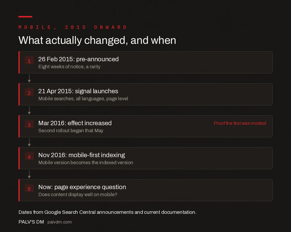
What actually changed, and when
- 26 Feb 2015: pre-announced. Eight weeks of notice, a rarity.
- 21 Apr 2015: signal launches. Mobile searches, all languages, page level.
- Mar 2016: effect increased. Second rollout began that May. Proof the first was modest
- Nov 2016: mobile-first indexing. Mobile version becomes the indexed version.
- Now: page experience question. Does content display well on mobile?.
Frequently asked questions
What was the Mobilegeddon update?
Mobilegeddon is the industry nickname for Google’s mobile-friendly ranking update, announced on 26 February 2015 and launched on 21 April 2015. Google described it as expanding its use of mobile-friendliness as a ranking signal, affecting mobile searches in all languages worldwide. The name was coined by the press and the SEO industry, not by Google.
Did Mobilegeddon really have a big impact?
Less than the name suggested. Google announced a second rollout on 16 March 2016 that increased the effect of the mobile-friendly ranking signal, which would have been unnecessary if the original had been devastating. Google also stated that a page with high quality content that is not mobile-friendly could still rank well, because query intent remains a very strong signal.
Is mobile-friendliness still a ranking factor?
There is no standalone mobile-friendly ranking system today. Mobile display is one question in Google’s page experience self-assessment, which asks whether content displays well on mobile devices. Google states that Core Web Vitals are used by its ranking systems, and that other page experience aspects do not directly help a site rank higher, though they improve usability.
What is the difference between mobile-friendly ranking and mobile-first indexing?
The mobile-friendly ranking signal, launched in 2015, adjusted positions on mobile search results only. Mobile-first indexing, which followed from 2016, means Google uses the mobile version of a site’s content, crawled with the smartphone agent, for indexing and ranking. If content is missing from your mobile HTML, it is missing from Google’s index entirely.
What breaks most often under mobile-first indexing?
Content, internal links and structured data that appear on the desktop version but not in the mobile HTML. Common causes are separate mobile templates with reduced content, sections collapsed out of the DOM rather than hidden with CSS, and lazy loading that the smartphone crawler never triggers. The symptom is pages that stop ranking for terms they previously covered.
Does responsive design solve mobile SEO?
It solves the largest part of it. Google recommends responsive web design because the same HTML is served on the same URL regardless of device, which removes most content-parity risk under mobile-first indexing. Responsive design does not by itself deliver good Core Web Vitals, and mobile performance remains the area where most sites fall short of the published thresholds.
Sources
- Finding more mobile-friendly search results — Google Search Central — The 26 February 2015 announcement
- Continuing to make the web more mobile friendly — Google Search Central
- Mobile site and mobile-first indexing best practices
- Understanding page experience in Google Search results
Want this done on your site?
Every PalV’s DM engagement starts with a free audit of your actual website — a 12-point
crawl covering what is blocking indexation, on-page gaps against your primary keywords, speed
findings, and the three to five fixes worth making first. Delivered in two working days. No
payment details, and the findings are yours whether you hire us or not.